1. Introduction: Why Logos Matter
Every successful brand starts with a strong visual identity, and the most recognizable element of that identity is the logo. Logos are not mere images—they are symbolic representations of a company’s values, mission, and personality.
A well-designed logo achieves multiple goals simultaneously:
- Brand Recognition: Customers instantly identify the brand in crowded marketplaces.
- Trust and Credibility: A professional logo communicates reliability and competence.
- Differentiation: Logos set your company apart from competitors.
- Marketing and Communication: Logos appear on websites, packaging, advertisements, and merchandise, maintaining visual consistency across all touchpoints.
For instance, Rapid Direct, a manufacturing company, uses an eagle concept logo symbolizing precision and strength. From machinery parts to website branding, the logo communicates professionalism and quality in an instant.
2. The Importance of Custom Logo Design
While AI-generated logos and templates might seem convenient, they often fail to deliver a unique and strategic identity. Here’s why custom logos are essential:
- Avoid Generic Designs: Templates often include stock icons, fonts, or shapes used by multiple brands.
- Optimized for Multiple Applications: Professional logos are designed for websites, print, merchandise, and digital media.
- Tailored Brand Strategy: Each element of a custom logo reflects the brand’s story, values, and target audience.
- Technical Efficiency: Templates can contain unnecessary CSS, JS, or bloated code if used for web-ready logos, affecting website performance.
At NUO PIXEL, our approach ensures every design is fully customized, optimized, and versatile, suitable for both digital and physical applications.
3. Logo Design Process: Step by Step
Designing a logo is a structured process combining creativity, strategy, and technical precision. Here’s the detailed NUO PIXEL workflow:
Step 1: Brand Research and Discovery
Before any design work begins, we conduct in-depth research to understand the brand completely. This step includes:
- Industry Analysis:
- Study the client’s sector, competitors, and market trends.
- Identify gaps and opportunities for differentiation.
- Audience Profiling:
- Understand the target demographic, their preferences, and behaviors.
- Ensure the logo resonates with the intended audience.
- Brand Personality & Values:
- Define attributes like innovative, luxurious, approachable, or energetic.
- Align visual style with brand messaging.
- Visual Preferences:
- Explore shapes, symbols, and color palettes.
- Discuss do’s and don’ts based on the client’s vision.
Example: For WellFit, the client wanted an energetic, dynamic identity. Through research, we identified movement and speed as key themes, guiding the concept of a running figure integrated into the logo.
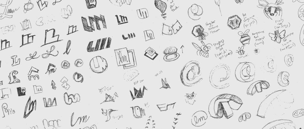
Step 2: Ideation and Sketching
Sketching is often the most time-intensive step, yet it’s crucial for creativity. NUO PIXEL designers start with paper and pencil before moving to any software.
Key activities:
- Concept Development: Translate brand insights into visual metaphors.
- Zintilon’s dragon concept represents strength and innovation.
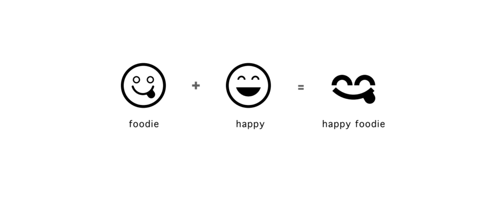
- FoodBelly’s smiley foodie communicates happiness and approachability.
- Multiple Variations: Produce dozens of rough sketches to explore composition, balance, and symbolism.
- Typography Experiments: Test letterforms, initials, or custom font ideas.
Sketching allows rapid exploration without the limitations of software, making it easier to iterate quickly.
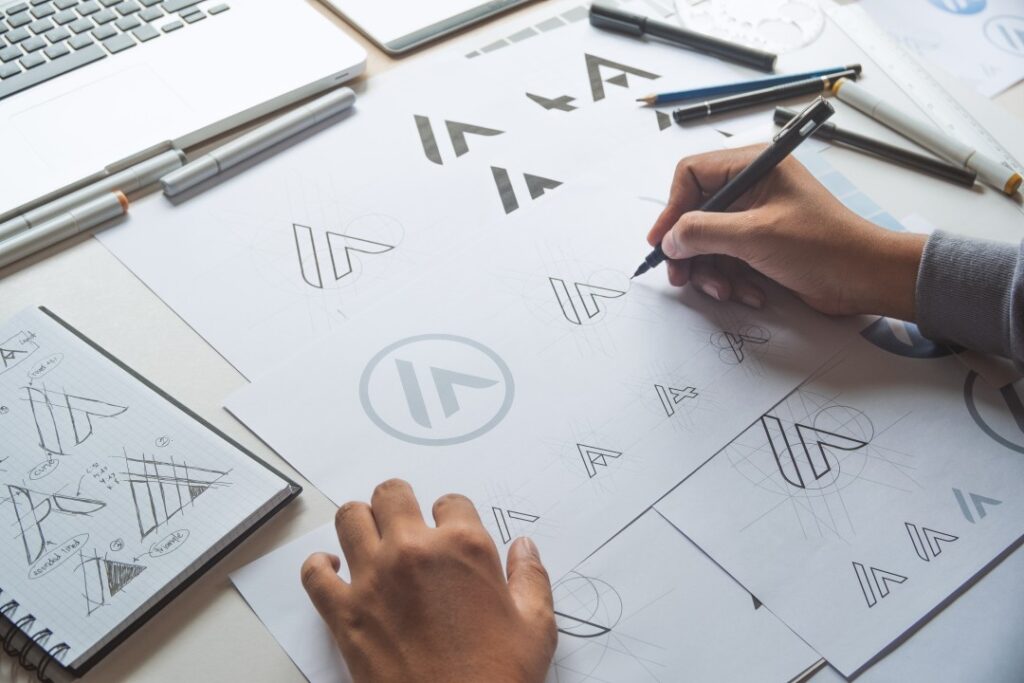
Step 3: Concept Refinement
Once the strongest sketches are identified, we refine them:
- Simplify Forms: Remove unnecessary details for clarity and memorability.
- Combine Ideas: Merge the best aspects of multiple sketches into a cohesive concept.
- Symbolism Check: Ensure the logo communicates the intended brand message effectively.
At NUO PIXEL, we spend significant time iterating on paper, as this step ensures the final digital version is built on strong conceptual foundations.
4. Vectorization: Turning Sketches into Scalable Logos
Once sketches are finalized, the next step is digital creation using vector software like Adobe Illustrator or CorelDRAW. Vector graphics are essential because they allow logos to be scaled infinitely without losing quality—something raster images (like JPEG or PNG) cannot achieve.
Why Vector Matters
- Scalability: Logos can be used on everything from a tiny app icon to a giant billboard.
- File Optimization: Vectors are lighter and cleaner for web and print.
- Editing Flexibility: Easy to tweak shapes, adjust curves, and modify design elements without starting over.
Vector Workflow at NUO PIXEL
- Tracing the Sketch:
- Import scanned sketches and use pen tools to create precise paths.
- Adjust anchor points for smooth curves and balanced geometry.
- Layer Organization:
- Separate logo elements (symbols, typography, icons) into layers.
- Maintain editable structure for future revisions.
- Path Optimization:
- Remove unnecessary anchor points to simplify shapes.
- Ensures clean, sharp output across all mediums.
- Alternative Layouts:
- Create horizontal, vertical, and icon-only versions for flexibility.
Example: The STAR LIGHT Cruises Halong logo required precise geometric curves to mimic a compass, ensuring the logo retained elegance at every size. Vectorization allowed us to maintain perfect proportions for both website and cruise merchandise.
5. Typography: Crafting Custom Letterforms
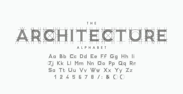
Typography is often the silent hero of a logo. Fonts convey personality, legibility, and professionalism. NUO PIXEL emphasizes custom typography whenever possible.
Why Custom Typography Matters
- Avoids generic typefaces used by competitors.
- Ensures harmony with symbols or icons.
- Enhances brand recognition by creating unique, memorable letters.
Process of Custom Typography
- Font Selection:
- Start with a base font that reflects the brand personality.
- Modify letterforms to match the concept.
- Letterform Modification:
- Adjust spacing (kerning) and proportions.
- Add unique strokes or shapes to reinforce brand identity.
- Integration with Symbols:
- Align typographic elements with icons or mascots.
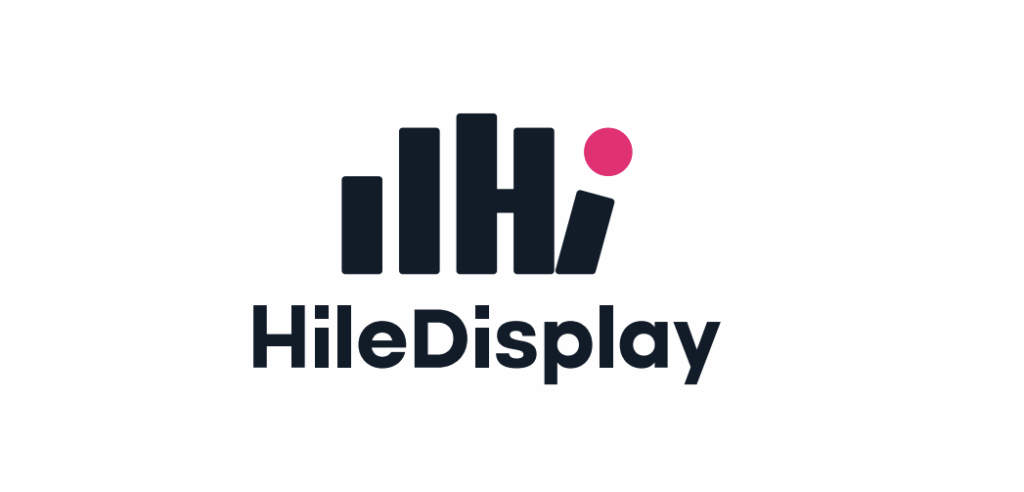
- Example: Hile Display uses the “Hi” in the hand as both typography and symbol.
- Technical Considerations:
- Ensure readability at small sizes.
- Optimize for print and web output (vector format).
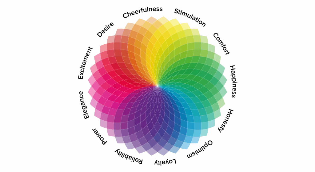
6. Color Theory: Communicating Emotion
Color is not just decoration; it conveys meaning and evokes emotion. Choosing the right palette is a strategic step in logo design.
Steps at NUO PIXEL
- Brand Alignment:
- Understand client’s industry and target audience.
- Example: WellFit uses bright, energetic colors representing vitality and health.
- Psychology of Color:
- Red → energy, passion, urgency
- Blue → trust, professionalism
- Green → growth, eco-consciousness
- Yellow → optimism, friendliness
- Contrast and Versatility:
- Logos must work in black & white, grayscale, and color.
- Ensure visibility on light and dark backgrounds.
- Color Systems:
- Use CMYK for print, RGB/HEX for digital.
- Provide Pantone equivalents for precise color reproduction.
- Secondary and Accent Colors:
- Support brand materials like business cards, websites, and packaging.
- Example: FoodBelly logo includes subtle accent colors for a playful, happy vibe.
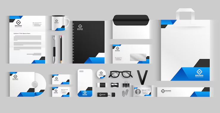
7. Supporting Elements: Icons, Mockups, and Brand Collateral
After the core logo is designed, it’s extended into supporting visual identity elements:
- Icons & Brand Marks:
- Create simplified symbols for app icons, social media, and favicons.
- Example: MFLOW uses the “O” as a pie chart icon for software interface.
- Mockups and Applications:
- Test logos on merchandise, business cards, uniforms, websites, and signage.
- Ensures practical usability across multiple touchpoints.
- Visual Identity (VI) Elements:
- Typography, patterns, color schemes, and graphic motifs are standardized.
- Example: Khadi Mangalam integrates Hindi-style decorative letters for all branding materials.
- Technical Output:
- Provide final logos in AI, EPS, SVG, PNG, and JPG.
- Include transparent backgrounds, responsive versions, and print-ready files.
8. NUO PIXEL Logo Case Studies
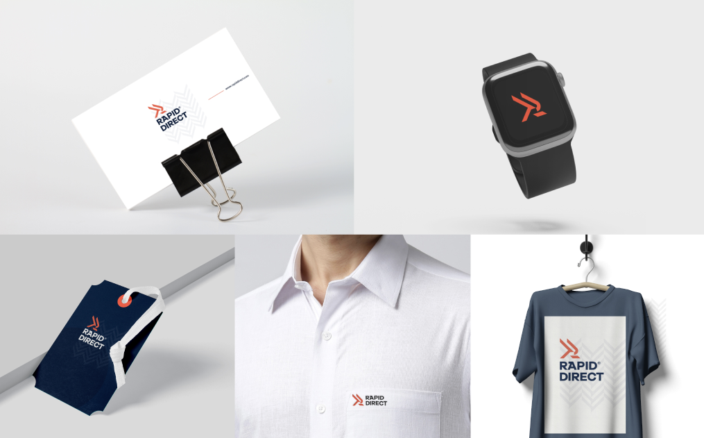
8.1 Rapid Direct (Concept: Eagle) – Manufacturing Company
Objective:
- Create a logo reflecting precision, speed, and industrial strength.
- Target audience: B2B clients in manufacturing and logistics.
Design Process:
- Sketching:
- Multiple eagle poses were sketched to represent agility and power.
- Focused on geometric shapes for industrial feel.
- Vectorization:
- Cleaned paths for sharp lines and dynamic curves.
- Eagle wings designed to point forward, indicating motion.
- Typography:
- Custom bold sans-serif font for “Rapid Direct.”
- Integrated subtle wing shapes into the letters.
- Color Palette:
- Dark blue → trust, stability
- Orange → industrial precision, speed
- Supporting Elements:
- Icon-only eagle version for small applications (favicon, app icon).
Outcome:
- Logo conveys speed, reliability, and professionalism.
- Scales from website banners to factory signage.
8.2 Zintilon (Concept: Dragon) – Manufacturing Company
Objective:
- Reflect strength, innovation, and industry dominance.
Design Process:
- Sketching:
- Dragon in dynamic coiled pose.
- Focused on sharp edges to reflect mechanical precision.
- Vectorization:
- Simplified forms for scalability.
- Created layered design for flexibility in color and background.
- Typography:
- Customized industrial-style lettering.
- Dragon motif subtly incorporated into the letter “Z.”
- Color Palette:
- Deep red → power, energy
- Dark gray → sophistication, industrial tone
Supporting Elements:
- Icon-only dragon head for app icons, stamps, and social media.
Outcome:
- Unique visual identity that stands out in a competitive industrial market.
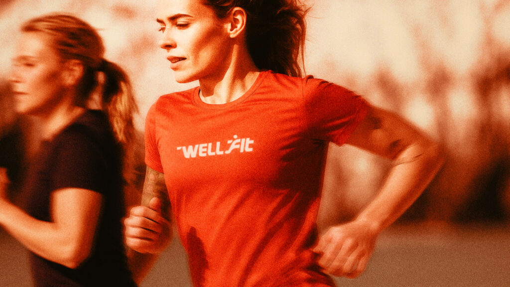
8.3 WellFit (Concept: Running) – Fitness & Wellness
Objective:
- Capture movement, vitality, and health for fitness brand.
Design Process:
- Sketching:
- Silhouette of a running person integrated into the letter “W.”
- Explored dynamic motion lines for speed.
- Vectorization:
- Smooth curves for flexibility in scaling.
- Multiple layout versions: horizontal, icon-only, and full logo.
- Typography:
- Rounded, friendly sans-serif font.
- Minor italicization to convey forward motion.
- Color Palette:
- Energetic gradient: orange → yellow → vitality
- Secondary green for wellness aspects
Supporting Elements:
- Branded merchandise like T-shirts, gym bags, and social media icons.
Outcome:
- Logo evokes activity, optimism, and well-being.
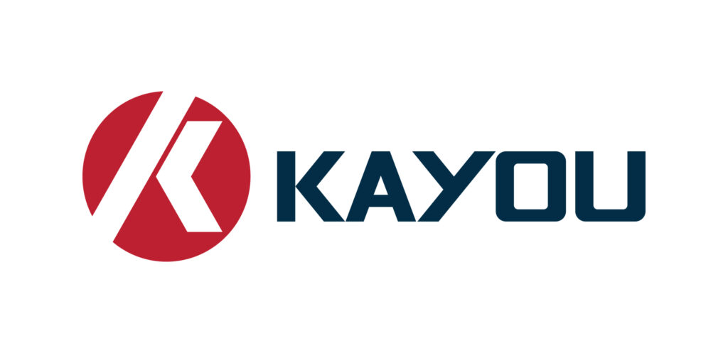
8.4 Kayou Mold (Concept: Mold) – Molding Company
Objective:
- Represent precision, engineering, and reliability.
Design Process:
- Sketching:
- Mold icon with 3D perspective to indicate manufacturing depth.
- Vectorization:
- Focus on technical accuracy for mechanical impression.
- Typography:
- Strong geometric font reflecting industrial stability.
- Color Palette:
- Industrial gray and Dark Red for professional appeal.
Supporting Elements:
- Business cards, product labels, and factory signage.
Outcome:
- Logo clearly communicates industrial expertise.
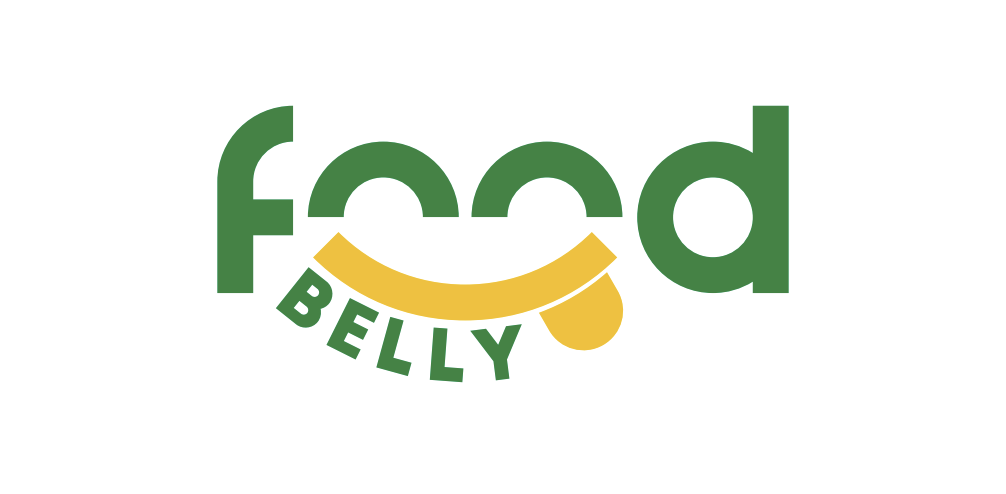
8.5 FoodBelly (Concept: Smiley, Happy Foodie) – Food Delivery
Objective:
- Create a fun, approachable, and happy brand identity.
Design Process:
- Sketching:
- Smiling face integrated with a plate or food element.
- Explored playful shapes for emotional appeal.
- Vectorization:
- Rounded, friendly shapes for digital platforms.
- Typography:
- Custom bubbly font to reinforce cheerful tone.
- Color Palette:
- Salem Green and Selective Yellow → appetite, joy
- Contrasted with soft brown for food realism
Supporting Elements:
- App icons, social media branding, packaging designs.
Outcome:
- Logo enhances memorability and customer engagement.
8.6 STAR LIGHT Cruises Halong (Concept: Compass) – Luxury Cruise Line
Objective:
- Evoke luxury, elegance, and navigation for a high-end cruise experience.
Design Process:
- Sketching:
- Compass rose integrated with subtle waves.
- Explored circular shapes to symbolize completeness and premium service.
- Vectorization:
- Maintained precise angles for the compass points.
- Scalable design for banners, tickets, and merchandise.
- Typography:
- Elegant serif font with custom ligatures for sophistication.
- Minor curves to reflect fluidity of water.
- Color Palette:
- Deep navy → luxury, stability
- Red → premium, elegance
Supporting Elements:
- Stationery, onboard brochures, website header, social media icons.
Outcome:
- Logo conveys trust, adventure, and luxury in a single visual.

8.7 Hile Display (Concept: Hi, Five Fingers from Hand) – Custom Acrylic Display Stand
Objective:
- Communicate creativity, precision, and uniqueness in display solutions.
Design Process:
- Sketching:
- Hand silhouette with five fingers forming a dynamic gesture.
- Explored variations for different angles and perspectives.
- Vectorization:
- Clean, geometric shapes for acrylic production.
- Simplified for laser cutting and engraving applications.
- Typography:
- Bold sans-serif font to complement hand icon.
- Customized kerning to integrate with icon seamlessly.
- Color Palette:
- Rich Back Fogra, Deep Sky elements for acrylic feel
- Flickr Pink accent color for visibility
Supporting Elements:
- Product packaging, website, and promotional materials.
Outcome:
- Logo reflects innovation and precision in custom display solutions.
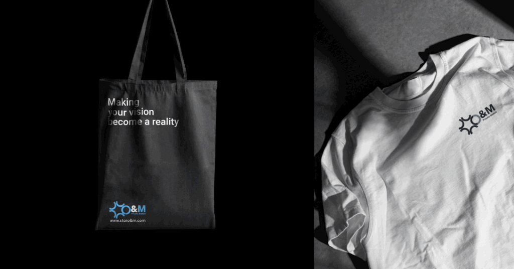
8.8 Star O&M (Concept: Star and “O”) – Construction Company
Objective:
- Showcase strength, reliability, and growth in construction.
Design Process:
- Sketching:
- Star integrated into the “O” for symbolic excellence.
- Explored angular shapes to convey building structures.
- Vectorization:
- Simplified for scalability on machinery, vehicles, and uniforms.
- Typography:
- Bold, industrial font with strong lines.
- Customized angles matching star geometry.
- Color Palette:
- Gray → professionalism
- Sky Blue → energy and visibility
Supporting Elements:
- Signage, business cards, uniforms, project banners.
Outcome:
- Logo visually communicates excellence in construction projects.
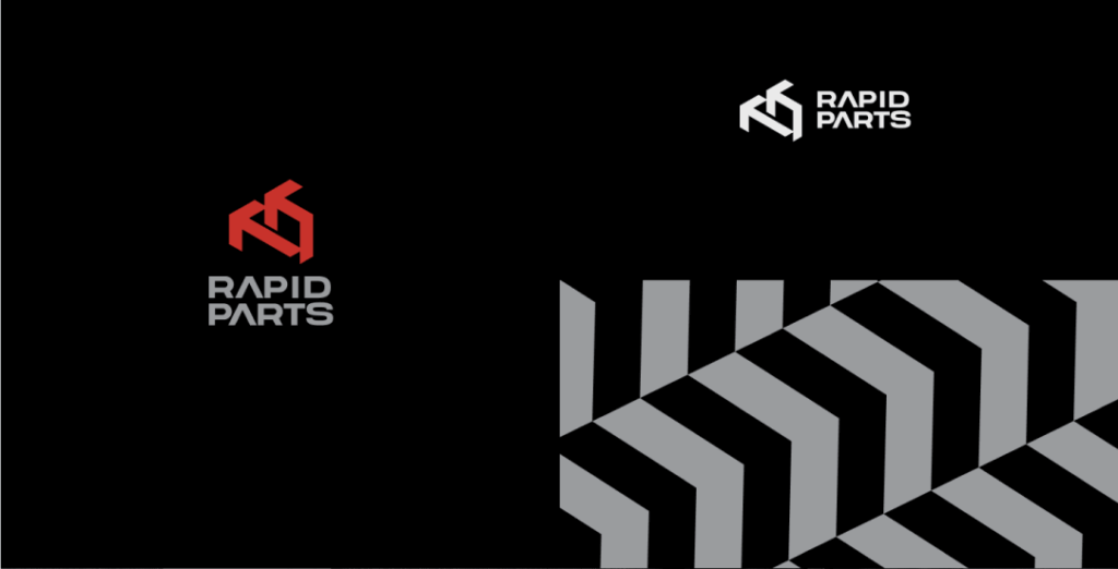
8.9 Rapid Parts (Concept: Arrow and Shadow) – Manufacturing Company
Objective:
- Represent speed, precision, and manufacturing expertise.
Design Process:
- Sketching:
- Arrow integrated with negative space for depth.
- Explored shadow effects for 3D impression.
- Vectorization:
- Maintained geometric precision for manufacturing branding.
- Typography:
- Custom sans-serif font with slight forward tilt for motion.
- Color Palette:
- Steel gray → industrial reliability
- Red accent → excitement
Supporting Elements:
- Website, business cards, factory signage, machinery labels.
Outcome:
- Logo reflects speed, efficiency, and reliability in manufacturing.
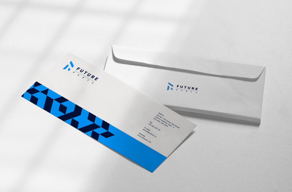
8.10 Future Parts (Concept: Negative Space, Molded Part) – Parts Manufacturer
Objective:
- Communicate technical expertise and innovation in parts manufacturing.
Design Process:
- Sketching:
- Negative space used to show a molded part within letters.
- Explored symmetry and precision.
- Vectorization:
- Focused on minimal, precise lines for clarity at small sizes.
- Typography:
- Industrial geometric font with custom kerning.
- Color Palette:
- Dark gray → technical precision
- Highlight Blue for innovation
Supporting Elements:
- Product branding, packaging, website, marketing materials.
Outcome:
- Logo communicates innovation, precision, and manufacturing excellence.
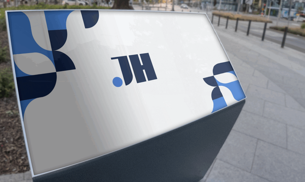
8.11 Jia Heng (Concept: JH, Luxury Design) – Expert in Molding, Casting, Extrusion
Objective:
- Convey luxury, sophistication, and craftsmanship.
Design Process:
- Sketching:
- “JH” initials explored in intertwined, luxury-inspired forms.
- Iterated on flourishes for elegance.
- Vectorization:
- Smooth curves and refined details for high-end application.
- Typography:
- Custom serif font complementing the initials.
- Minor ligatures for a unified look.
- Color Palette:
- Dark Blue → luxury, authority
- Light Blue → premium, craftsmanship
Supporting Elements:
- Corporate stationery, product branding, signage.
Outcome:
- Logo exudes high-end craftsmanship and premium quality.
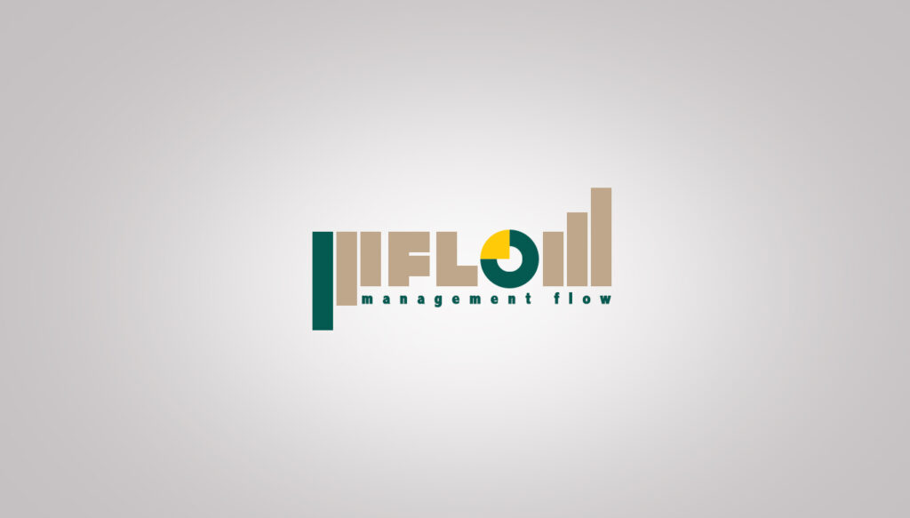
8.12 MFLOW (Concept: Graph, Charts, Pie in “O”) – Expense Tracking & Management Company
Objective:
- Represent data flow, analytics, and organized management visually.
Design Process:
- Sketching:
- Explored combining line graphs, pie charts, and bar charts within the “O” of MFLOW.
- Iterated multiple angles to balance readability with concept.
- Vectorization:
- Scalable design for apps, web, and print.
- Ensured all chart elements are clear at small sizes.
- Typography:
- Modern, clean sans-serif font reflecting technology and simplicity.
- Slight customization to integrate graph elements into letterforms.
- Color Palette:
- Yellow → cheerfulness
- Dark Green → growth, financial well-being
- Gold → luxury
Supporting Elements:
- App icons, dashboards, website, stationery.
Outcome:
- Logo communicates clarity, organization, and financial intelligence.
8.13 PSP (Concept: Books, Colors, Education Abroad) – Study Abroad Company
Objective:
- Convey learning, diversity, and guidance for international education services.
Design Process:
- Sketching:
- Explored open books, globe motifs, and graduation cap elements.
- Colorful accents to convey diversity and multiculturalism.
- Vectorization:
- Clean, scalable icons for digital and print media.
- Ensured simplicity for small-scale applications.
- Typography:
- Friendly sans-serif font for approachability.
- Slight custom ligatures to unify icon and text.
- Color Palette:
- Blue → trust and knowledge
- Red/Yellow → energy, inspiration
- Green → growth and progress
Supporting Elements:
- Website, brochures, banners, social media, student guides.
Outcome:
- Logo visually communicates guidance, education, and global opportunities.
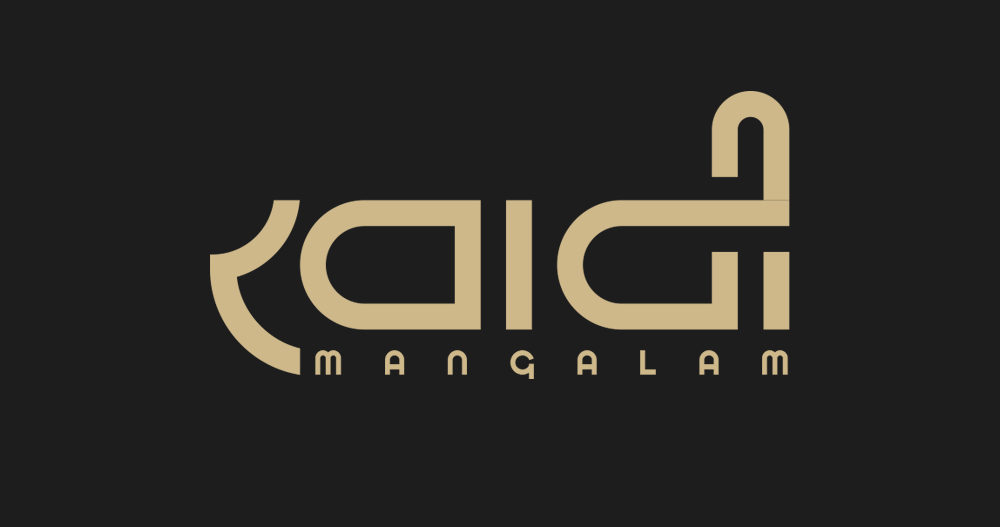
8.14 Khadi Mangalam (Concept: Hindi Words Designed as Décor) – Cotton Apparel Brand
Objective:
- Reflect cultural heritage, craftsmanship, and premium textile quality.
Design Process:
- Sketching:
- Hindi typography stylized as decorative patterns.
- Explored weaving patterns, flow of letters, and textile motifs.
- Vectorization:
- Maintained intricate details while ensuring clarity for print.
- Scalable for clothing tags, fabric labels, and online media.
- Typography:
- Custom, hand-drawn Hindi script for authenticity.
- Balanced decorative details with readability.
- Color Palette:
- Accent colors → branding consistency
- Natural shades → cotton, authenticity
Supporting Elements:
- Fabric tags, product packaging, social media visuals.
Outcome:
- Logo preserves Indian heritage while highlighting premium quality.
8.15 HongJing (Concept: Eye with Colors) – Lens Manufacturer
Objective:
- Communicate vision, precision, and optical expertise.
Design Process:
- Sketching:
- Explored abstract eye shapes with integrated lens effects.
- Iterated color schemes to symbolize clarity and optical excellence.
- Vectorization:
- Simplified design for visibility at various scales (lenses, packaging, website).
- Typography:
- Sleek, modern sans-serif font complementing futuristic optical theme.
- Color Palette:
- Blue → trust, clarity
- Gradient accents → innovation, precision
Supporting Elements:
- Product packaging, website, corporate identity, social media.
Outcome:
- Logo effectively communicates focus, vision, and optical innovation.
✅ Conclusion & Key Takeaways
Through these 15 logo case studies, the journey of creating a logo is not just about aesthetics—it’s about strategy, research, sketching, technical precision, and supporting brand identity.
Every step—from sketching on paper, vectorization, color theory, typography, to application on real-world elements—affects how the audience perceives the brand. A strong, custom logo enhances brand recognition, trust, and professional identity, far beyond what a generic template can achieve.
NUO PIXEL, led by Head Designer Nitin Singh, ensures that every logo is a bespoke creation, technically robust, scalable, and aligned perfectly with the brand’s vision.
Want a custom logo designed for your brand? Contact NUO PIXEL today.
FAQs: Custom Logo Design & Branding
A custom logo is the face of your brand. It communicates your business values, establishes credibility, and makes your company memorable. Unlike generic templates, a custom logo is unique to your business, ensuring you stand out in a competitive market. Professional designers consider your brand personality, target audience, and industry trends to craft a logo that resonates with your customers.
The timeline varies depending on the complexity and the designer’s process. On average, it takes 2–6 weeks from initial brainstorming and sketching to the final vector-ready logo. This includes research, concept creation, multiple iterations, color testing, typography exploration, and finalizing supporting brand elements.
A typical professional logo design process includes:
Research & Brainstorming: Understanding the brand, competitors, and audience.
Sketching: Drawing multiple concepts on paper to explore ideas.
Vector Drafting: Digitizing sketches using tools like Adobe Illustrator or Figma.
Typography & Color Selection: Choosing fonts, color palettes, and testing readability.
Iterations & Feedback: Refining the design based on client input.
Finalization & Deliverables: Creating scalable files for web, print, and branding materials.
AI-generated logos can be a starting point, but they lack the human touch, strategy, and uniqueness a professional designer provides. AI may produce generic results, overlook brand story, and fail in areas like typography balance, color psychology, and scalability. Custom logo design ensures your logo is one-of-a-kind and perfectly aligned with your business goals.
A professional logo should come in multiple formats:
Vector (AI, SVG, EPS): Scalable without losing quality, ideal for print and large signage.
Raster (PNG, JPEG): Perfect for websites, presentations, and social media.
PDF: Versatile for both print and digital use.
Costs vary depending on designer experience, complexity, and deliverables. Professional logos can range from $$$ to $$$$. Investing in a high-quality logo pays off by creating a strong brand identity, customer trust, and consistent visual presence.
Yes! Logo redesigns are common as businesses grow or pivot. A redesign might include modernizing typography, tweaking colors, or simplifying complex elements. However, a strong initial design reduces the need for frequent changes.
A logo is just one component of a visual identity, which includes color palettes, typography, patterns, icons, and brand guidelines. A cohesive visual identity ensures consistent branding across all channels—websites, social media, merchandise, packaging, and more.
Our designers conduct thorough research to avoid similarities with competitors or existing trademarks. We focus on original concepts, typography, custom icons, and thoughtful symbolism, ensuring your logo is entirely unique and legally safe.
Yes! For example: (you have already checked them if you have ready this blog completely)
Rapid Direct: Concept “Eagle,” for a manufacturing company.
Zintilon: Concept “Dragon,” for a manufacturing business.
WellFit: Concept “Running,” for wellness and fitness.
STAR LIGHT Cruises Halong: Concept “Compass,” for a luxury cruise line.
Each logo reflects careful research, concept creation, sketching, vector design, and a unique color and typography scheme tailored to the brand.
Want a Custom Designs for Your Brand?
Let NUO PIXEL craft design that defines your brand’s identity — creative, memorable, and made to stand out.
Contact NUO PIXEL Today