Nuo Pixel Solutions / Brand identity case study
Zintilon.
From a concept
to a distinctive Z.
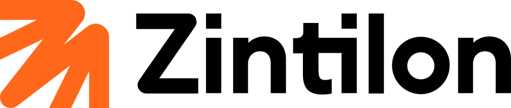
Our logo design work connects an expressive starting point with a compact symbol and a confident wordmark. This case study brings together the blue launch identity and the orange/black version we also designed.
01 / A new name, a visual direction
Give the identity
a clear point of recognition.
The client’s public announcement
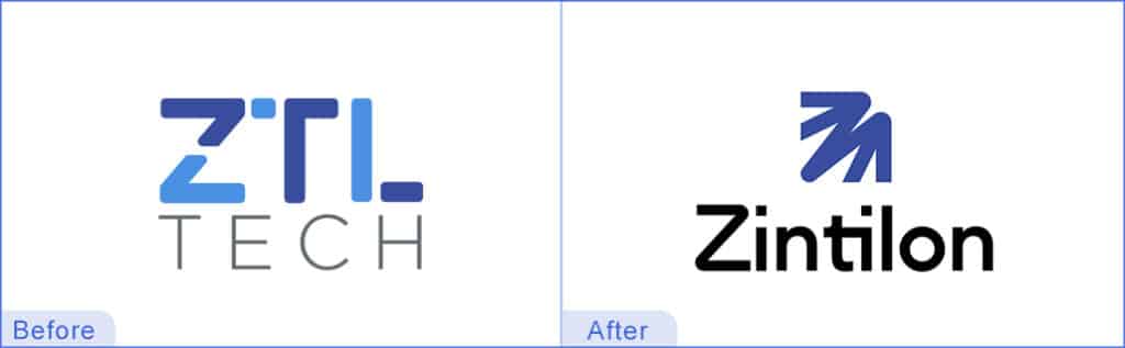
Zintilon’s August 2024 announcement introduced the move from ZTL TECH to Zintilon. It connects the name to Zheng Tai Long, retains the Z, T and L initials, and describes a blue, dragon-inspired logo expressing ambition and cultural roots.
Our design work gives that identity a graphic form. The challenge is to create a symbol that has an individual character while remaining compact enough to sit beside a name, inside a small digital space or within a larger branded layout. A name and a symbol should support each other as a single visual statement.
The two color versions presented here belong to our work for the brand. We identify them separately throughout the case study so the visual discussion remains precise. The blue version is documented in the client’s launch material; the orange/black version is shown in our supplied portfolio artwork.
02 / From illustration to a usable form
The concept starts with character.
The icon keeps what matters.
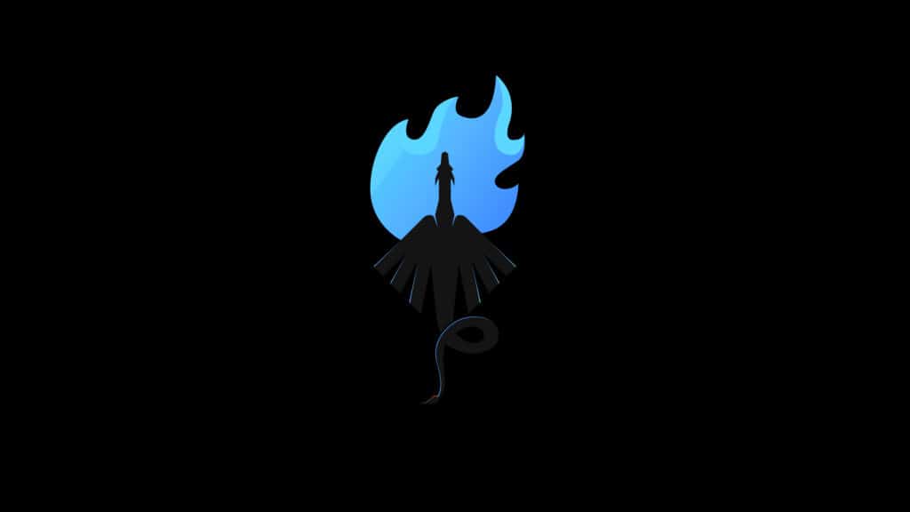
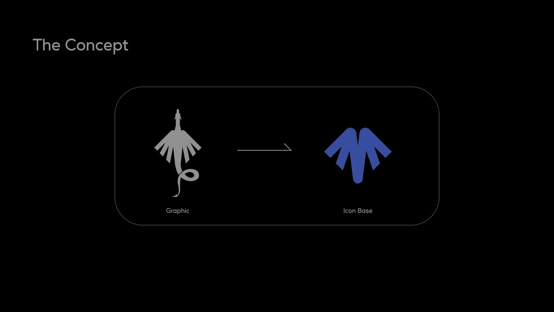
The dragon reference offers an expressive starting point: a central body, radiating wing-like forms and an upward gesture. Our concept work asks which relationships are essential once that description becomes a small graphic. The aim is a strong silhouette with a controlled amount of detail.
The supplied concept board shows the abstraction directly. A detailed gray graphic appears on one side and a simplified blue icon base on the other. The outer rhythm becomes more regular, the central relationship becomes clearer and the form gains a more economical contour. The drawing moves toward a visual language that can be used repeatedly.
That reduction is a deliberate design judgment. We compare what the silhouette communicates with how clearly its parts separate. If the mark keeps too much illustration, it can become fragile at a small scale. If it loses every distinctive relationship, it can become anonymous. The useful result sits in the balance between those extremes.
03 / A symbol with its own structure
Bring the initial
into the idea.
The next concept board shows the icon base alongside a Z, followed by the resulting mark. It makes the synthesis visible: the character of the original form is reorganized into a more directional silhouette. The initial supplies a relationship to the name, while the repeated strokes give the symbol a distinct rhythm.
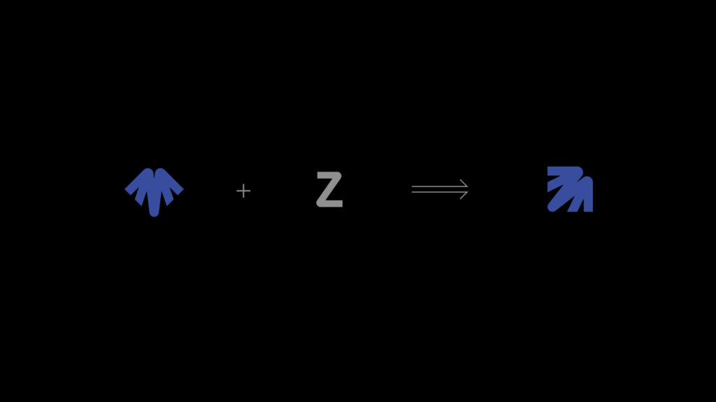
Our technical interest is in how those parts become one readable unit. The resulting contour has an ascending gesture and a substantial lower termination. Its internal openings separate the strokes, and the repeated diagonal relationships keep the visual movement coherent. Those decisions let the mark suggest a direction without drawing a literal scene.
The combination also avoids asking the wordmark to carry the entire identity on its own. The symbol provides a recognizable visual cue beside the name. The two elements can then be considered together for a full lockup, or separately when a particular application calls for a compact brand signature.
04 / Two versions of our identity work
A shared shape.
Different color relationships.
Color changes the emphasis of a mark even when its recognizable structure remains. Blue gives the symbol one temperature and relationship to the surrounding space. The orange version introduces a warmer visual accent against the black name. In both versions, the dark lettering provides a stable reading point while the symbol carries a more expressive gesture.
From our studio perspective, this is a useful way to discuss the identity: separate the enduring relationships of contour, spacing and hierarchy from the behavior of a particular color treatment. It allows the visual analysis to remain specific and keeps decisions about artwork versions clear when files are prepared or applied.
05 / The detail that makes the drawing work
Concept and construction
need each other.
Stroke relationships
The symbol’s repeated directional forms establish a consistent visual pattern. The openings between them must preserve separation without breaking the larger silhouette into unrelated pieces. This relationship between positive and negative space is central to the mark’s character.
Optical weight
Different contours occupy space differently. A lower curve can feel heavier than a narrow diagonal, while a gap can appear smaller than its measured width. We judge those relationships together, looking for a coherent visual balance rather than relying only on geometric equality.
Name and symbol
The wordmark’s substantial lettering anchors the more active symbol. The space between the two affects whether they read as one identity. A full lockup needs room for both recognition and legibility, especially when it sits near other content.
The typographic relationship is particularly important when a new name needs to become familiar. The wordmark should remain easy to identify beside the distinctive symbol. A strong illustration cannot compensate for a name that becomes difficult to read, so we consider letter shape, apparent spacing and overall proportion as part of the same composition.
Application work continues that reasoning. Clear space, background choice and appropriate versions help preserve the identity’s visual hierarchy. A production package must make it easy for another person to select the intended artwork and understand how to use it, whether the destination is a digital interface, a document or a physical item.
06 / What this project demonstrates
Meaning carried
through the drawing.
The concept boards make our design reasoning tangible. A detailed starting point becomes an icon base; that base is combined with a letter relationship; the resulting symbol is paired with a readable name. Each step resolves a different design question while contributing to the same visual identity.
The work demonstrates our approach to logo design as both an artistic and a technical discipline. The idea gives the mark a reason to exist. Construction gives it a consistent shape. Typography gives the name a voice. Preparation and guidance help the business carry those decisions into everyday use.
For a new brand or a redesign, that connected way of working provides a useful foundation. The client can understand the reasoning behind the mark, compare visual decisions with the brief and discuss future applications using a shared vocabulary.
Questions about the identity.
Did Nuo Pixel Solutions design both versions shown here?
Yes. Our studio designed both the blue identity and the orange/black version. The case study labels the versions separately and links to the client’s public announcement for the blue launch context.
Why show the concept boards as well as the finished logo?
The boards reveal how the idea develops. They connect the expressive starting point with the simplified icon base and the Z relationship, helping a reader understand the drawing as a sequence of decisions rather than an isolated finished image.
Can an identity use different color treatments?
A brand can have defined artwork versions for different applications or periods of use. Each version needs a clear purpose and guidance. The relevant file, background and color treatment should be identified explicitly so future applications stay consistent.
An identity with a reason behind it
Let’s explore the idea
inside your brand.
Bring us your name, your audience and the next direction for your business. We can help turn that starting point into a considered visual identity.