Brand identity / Concept · craft · application
FOOD BELLY: A happy-foodie idea, built into the name.
Our FOOD BELLY logo concept combines food and happiness through a compact smiling mark, expressive lettering, a green/yellow palette and a developed set of brand applications.
Nuo Pixel Solutions · Design by Nitin Singh · Design and technology since 2015
01 / FOOD BELLY
An approachable identity with a clear emotional cue
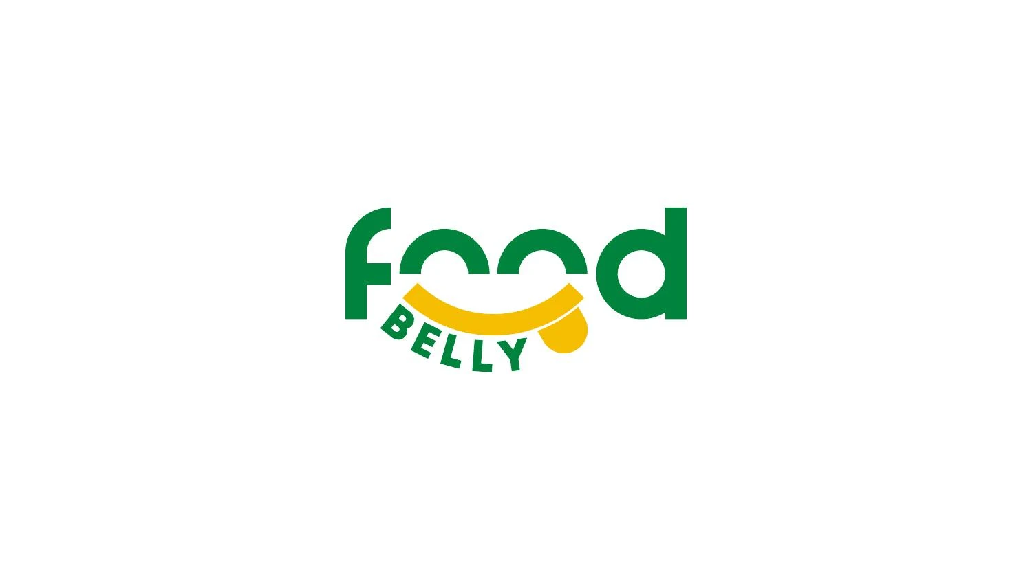
The FOOD BELLY presentation asks for a simple, relevant and memorable brand signature. Nuo Pixel Solutions explored a direction rooted in a familiar experience: the pleasure associated with food. The concept sequence combines a foodie cue with happiness, producing a compact smiling form that can sit within a more expressive wordmark.
The design challenge is to make that friendliness specific. A smile on its own is widely used, while a literal food illustration can become tied to one menu item or product. The supplied direction brings the expression into the lettering and the brand name, creating a closer relationship between what the company is called and how the identity feels.
This case examines the main green/yellow concept, its sketches, construction, typography and application studies. The source also includes alternative colors and different logo directions. Those are labeled as alternatives rather than presented as interchangeable approved masters. No commercial result, customer research statistic or operational business scope is inferred from the deck.
02 / FOOD BELLY
From foodie + happy to one mark
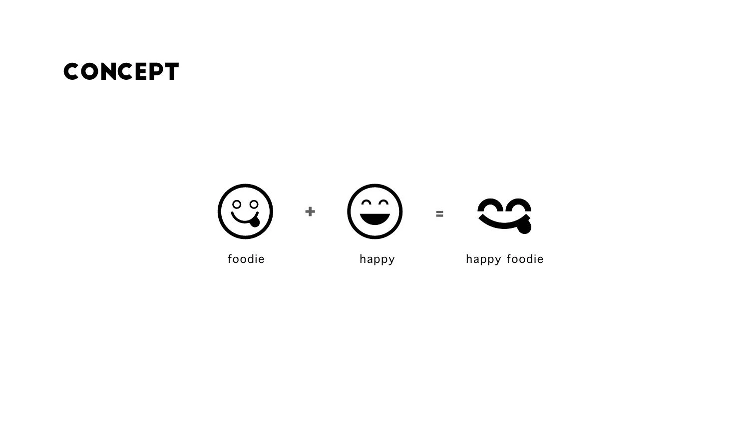
The concept page shows a progression from “foodie” and “happy” to a combined “happy foodie” idea. The result uses a rounded, smiling structure that connects naturally with the repeated rounded forms in the word food. This gives the identity an emotional cue while preserving a relationship to the name.
The most useful conceptual economy is that the expression does not require a separate mascot illustration. A few carefully placed curves can suggest satisfaction without adding eyes, hands, utensils and decorative ingredients to every appearance of the logo. That restraint helps the mark remain compact and easier to reproduce.
The concept should still work before it is explained. A viewer can first encounter a friendly, distinctive composition and read the name; the presentation then reveals how its parts were combined. A logo rationale is strongest when it makes the visible design more understandable, rather than asking the viewer to accept a story that the drawing does not support.
03 / FOOD BELLY
Rough exploration and the selection of a direction
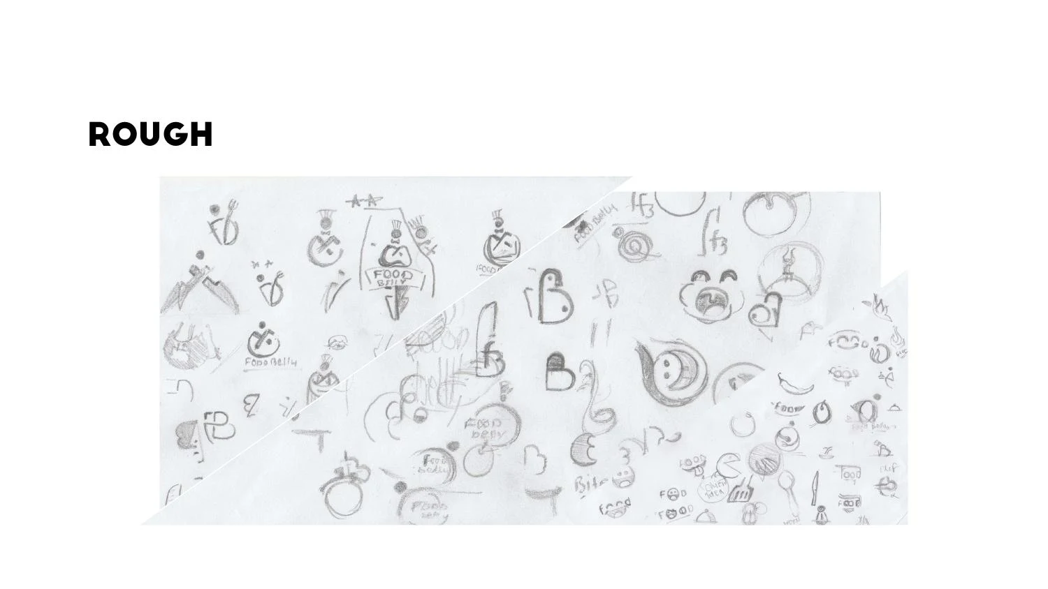
The rough-work page contains many small sketches, including different ways of relating letters, containers and food-associated shapes. That breadth is valuable because food branding has many familiar visual conventions. Early exploration helps test whether a direction can become distinctive without relying on an unnecessary collection of category symbols.
Sketching also makes it easier to compare emotional tone. One drawing can feel playful, another formal, another too childish or too dependent on a particular illustration. The right balance depends on the client’s audience and business positioning. A professional process uses those questions to evaluate ideas before investing heavily in polished applications.
The supplied material supports a story of exploration followed by a smiling wordmark direction. It does not reveal every client conversation or the exact sequence of approvals. We show the rough work as source evidence and discuss the design reasoning without inventing the number of rounds or claiming that every alternative was rejected for a documented business reason.
04 / FOOD BELLY
Constructing a smile that survives reduction
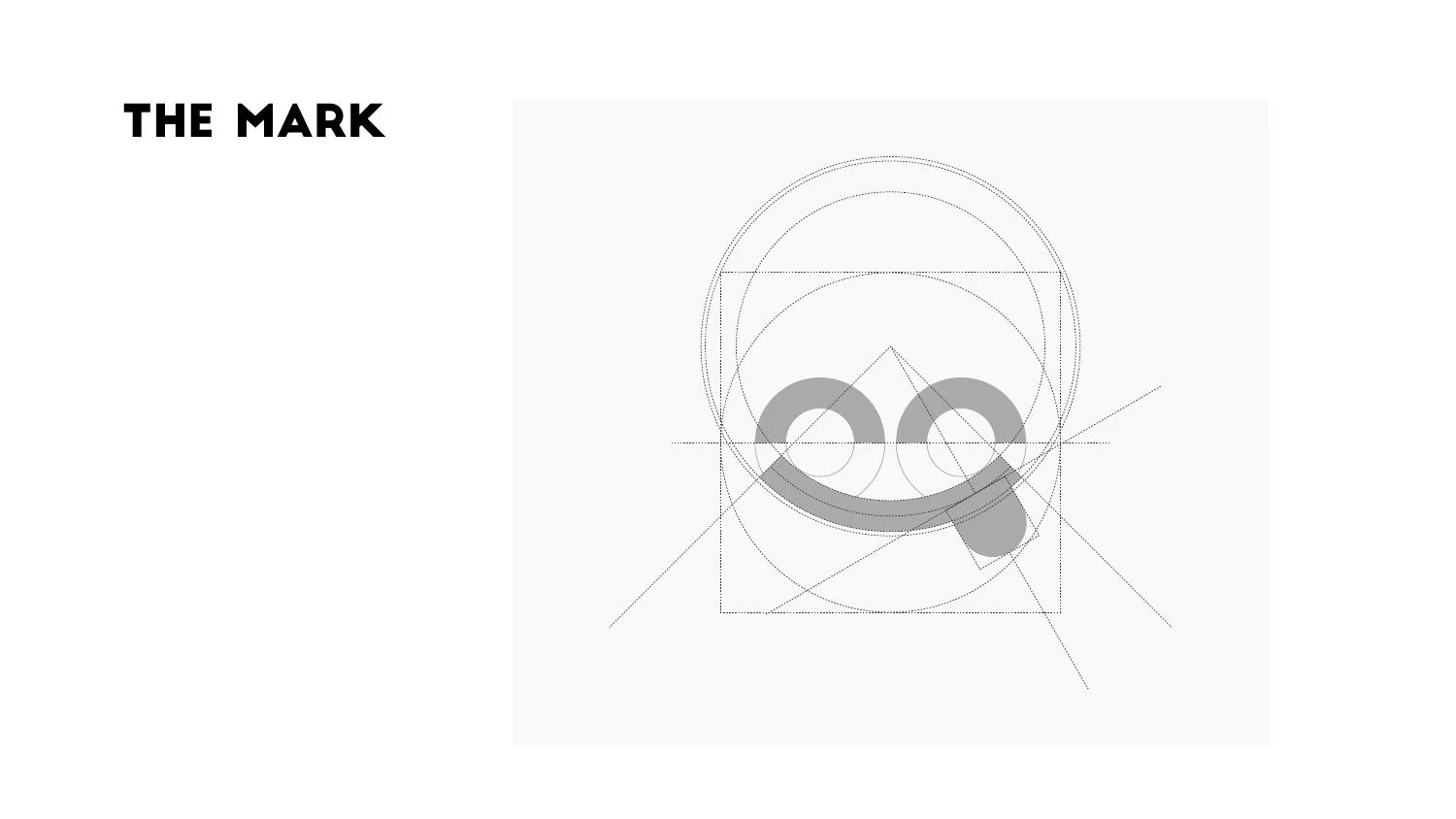
The mark-construction page shows circular and linear guides around the compact symbol. Rounded geometry can create a natural connection between the eyes or letter counters and the curved smile. The challenge is to keep the internal spaces open and the expression readable as the artwork becomes smaller.
A smile is especially sensitive to proportion. A change in curvature can make it appear relaxed, exaggerated or awkward. The relative size of the rounded forms affects whether the viewer reads a face, a pair of letters or an abstract pattern. Those readings can coexist, but the arrangement needs to be intentional.
The final vector should simplify the selected geometry into a clean filled form. Excess points can introduce uneven curves and make later production more difficult. A construction grid is a useful guide, but the filled silhouette and actual small-use rendering remain the deciding tests. The aim is an expressive identity that does not depend on a large presentation to be understood.
05 / FOOD BELLY
Lettering turns the concept into a name
The main wordmark gives food a prominent, rounded treatment, with BELLY arranged beneath in a curved relationship. This produces a hierarchy that first attracts attention through the larger name and then completes the brand reading. The smile-like structure ties the levels together rather than leaving BELLY as unrelated secondary text.
Curved secondary lettering introduces technical questions. Its apparent spacing changes around an arc, and letters at different angles can feel uneven even when their measured distances match. The designer needs to assess the whole composition, not only individual character positions. At small sizes, the smaller BELLY line can reach its legibility limit before the larger forms do.
The presentation includes alternate typographic concepts. Their existence does not mean all versions should be used simultaneously. A final identity system should establish a primary lockup and identify any compact or one-color alternatives. Archived explorations can remain valuable process material without becoming a source of confusion for someone preparing a menu, package or website.
06 / FOOD BELLY
Green and yellow with documented references
The main palette page lists green #00843D and yellow #F6BE00, with Pantone references 348 C and 7408 C. These are references documented in the supplied presentation. They provide a more explicit starting point than sampling a screenshot, although any particular print output still requires an agreed process and proofing approach.
The main applications use the green as a stable identifying color and the yellow as a warm contrast. The palette can also create larger fields and supporting patterns, helping the identity extend beyond a small logo. The balance matters: if every surface uses every color at the same intensity, the result can lose hierarchy.
The deck’s alternate brown/orange and blue/orange directions are shown as alternatives. They help document exploration but should not be confused with the main green/yellow case. A production handover should distinguish the selected palette, any approved exceptions and historical concepts. That clarity is part of maintaining a recognizable brand over time.
07 / FOOD BELLY
Supporting graphics and application studies
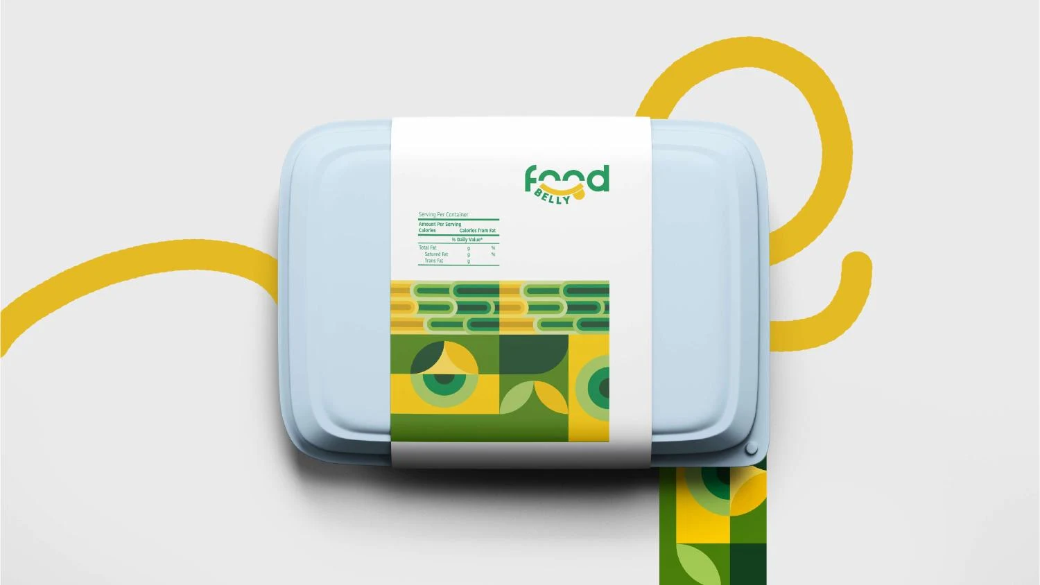
The presentation extends the rounded geometry into block-based patterns and branded surfaces. This is a useful way to make the identity feel complete without drawing a new illustration for every application. A repeated curve or circular segment can echo the logo while giving layouts a flexible supporting language.
The deck also includes a bag-like application and app-icon studies. The compact smiling symbol can perform a different role from the full wordmark: it can identify a small square area where the entire name would be difficult to read. Its padding and background need to be designed together, so the mark does not appear crowded or detached.
These applications are mockups. They demonstrate how the identity could behave across surfaces, not proof that a digital app was released or every pictured item manufactured. A real packaging or print project would also need content, dimensions, production constraints and any applicable product-information requirements. Those details should be scoped explicitly rather than assumed from a brand presentation.
08 / FOOD BELLY
Practical checks for a friendly food identity
The first reduction test should examine the smile, the rounded internal spaces and the smaller BELLY lettering. A friendly expression can disappear if the gaps merge or the secondary name becomes illegible. A compact mark may be preferable for certain small uses, but its relationship to the full signature should be defined rather than improvised.
Next, check the identity in one color and on realistic backgrounds. A delivery label, a low-cost print job and a website header do not offer the same conditions as a pristine presentation. A mark that remains recognizable without its full palette gives the client more practical options. Reversed versions should be tested separately, since light shapes can appear fuller on a dark ground.
Finally, review the identity beside actual content. Long product names, prices, contact details and photography can reveal spacing problems that a standalone logo slide hides. These are recommended application checks, not a claim that we performed a documented audit of FOOD BELLY’s operational materials. They show how our design reasoning continues beyond the initial concept.
09 / FOOD BELLY
Client review: personality without ambiguity
The FOOD BELLY direction benefits from a review that considers expression and readability separately before judging the composition as a whole. The smiling structure should feel approachable, while the name should remain easy to identify. If a viewer notices the expression but cannot read the company name, the hierarchy needs further work.
The curved BELLY line introduces a useful practical test. It should be checked at the actual sizes planned for labels, cards and digital headers. A large presentation can disguise the point at which secondary lettering becomes too small. Where the compact smiling symbol is used alone, the context should provide enough brand identification that the abbreviation remains useful rather than cryptic.
A handover package should label the green/yellow direction clearly and keep alternate concepts in a separate archive. The source contains several appealing explorations, but a consistent identity requires a clear primary choice. File naming should make it difficult to send an alternate-color concept to a supplier by mistake. Mockups, master logos and editable application layouts should also be distinguished.
For physical output, the main questions include substrate, available colors, finishing and the amount of detail the process can reproduce. A bright screen preview is not a print proof. A bag presentation is not a completed packaging dieline. The identity can guide those later projects, but each requires its own technical preparation and approval. Clear scope avoids promising a production-ready application when the source only demonstrates a visual direction.
For a new food-brand commission, discovery would examine the offering, audience, purchase context and intended tone before choosing between playful lettering, illustration or a more restrained identity. Competitor research would help identify conventions worth retaining and generic motifs worth avoiding. Sketches would then test those possibilities before vector refinement. This process allows personality to emerge through a specific idea rather than through an accumulation of decorative food symbols.
10 / FOOD BELLY
A concept that is expressive and usable
The FOOD BELLY work illustrates how a familiar emotion can become a specific identity when it is integrated with the name. The smiling structure, rounded lettering and controlled color relationships reinforce one another. The supporting pattern then gives the idea room to extend into a broader visual system.
For a client, the useful lesson is that an approachable brand does not need to be visually undisciplined. Friendly curves still require careful geometry. Playful typography still needs readable spacing. A bright palette still needs clear application rules. The craft is in making those constraints support the personality rather than suppress it.
Nuo Pixel Solutions combines concept exploration, illustration, lettering and production-minded identity design. This case brings those capabilities together through source sketches, a traceable concept and clear application studies. The original presentation is available below, allowing visitors to examine both the main direction and the alternatives with their roles clearly distinguished.
Explore the original design presentation
The selected artwork above is optimized for reading on this page. The original supplied presentation is also available from our WordPress Media Library. It provides the wider visual context, including concept explanations, identity variations and application studies. Where the source shows alternate concepts, those remain explorations rather than an instruction to mix different logo versions.
Application mockups communicate a design direction. Before commissioning physical output, confirm the approved master files, final specifications and requirements of the chosen production process. The analysis here distinguishes the presented work from recommended checks and does not invent commercial results or client quotations.
Practical questions
FOOD BELLY case study FAQs
What is the main FOOD BELLY concept?
The supplied deck combines foodie and happy cues into a smiling mark integrated with expressive food-related lettering.
Are the brown and blue versions the main identity?
They are labeled as alternative color directions in the source. This case focuses on the main green/yellow presentation.
Why include rough sketches in a case study?
They show how the idea was explored before refinement and help explain the relationship between the initial concept and the presented mark.
Nuo Pixel Solutions / Since 2015
Give your brand a clear, distinctive identity.
Tell us about your business, audience and the places your identity needs to work. We can help with research, concept development, sketching, illustration, logo lettering, vector refinement and a coordinated visual identity.