Brand identity / Concept · craft · application
JIA Heng: A compact monogram. A complete brand signature.
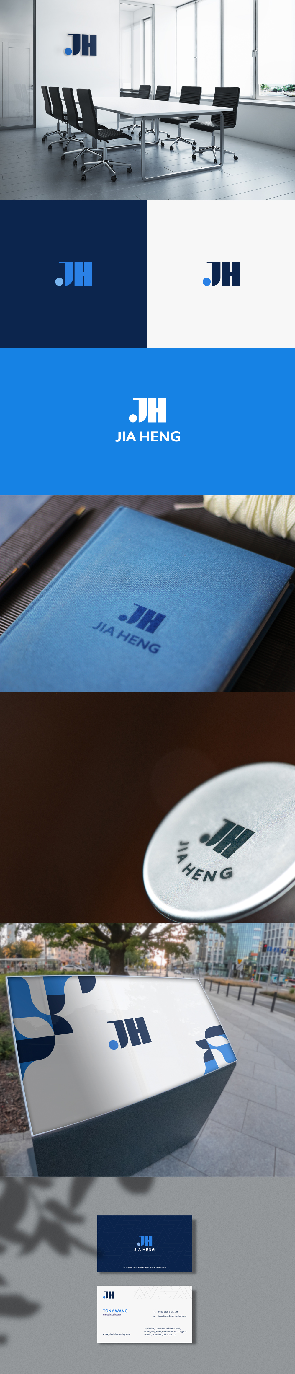
Nuo Pixel Solutions’ JIA Heng logo work brings the J and H initials into a compact blue identity, with a coordinated wordmark, stationery and environmental presentation.
Nuo Pixel Solutions · Design by Nitin Singh · Design and technology since 2015

01 / JIA Heng
The identity in one view
A brand signature does not have to look like handwriting. For JIA Heng, the supplied presentation shows a compact JH monogram: a closely composed pair of initials, a rounded terminal and a strong vertical rhythm. Nuo Pixel Solutions designed the identity to give the name a concentrated visual presence. The case is about the relationship between that small symbol and the larger system around it, from a wordmark beneath the initials to a mark occupying a room or a printed page.
The distinction matters when discussing signature-style logo design. An identity can act as a signature because it consistently identifies its owner, even when its construction is geometric. Here, the heavy upright strokes and circular detail establish a recognizable combination. The fuller JIA HENG name provides an explicit reading of the initials. The artwork can therefore support both a compact identification moment and a more explanatory introduction.
This case study examines the supplied identity board, including its color versions and application mockups. The mockups show proposed visual applications; they are not evidence of installed signage, manufactured merchandise or a measured commercial outcome. Our focus is the design work and the practical decisions that make its parts coherent.
02 / JIA Heng
Building recognition around J and H
An initial-based identity faces an immediate challenge: the alphabet is shared by every other company. The task is to make a particular arrangement feel deliberate without making the letters difficult to identify. In the JIA Heng artwork, the J and H sit closely together and share a substantial apparent weight. The arrangement creates one dominant shape rather than two unrelated characters placed beside each other.
The circular terminal at the lower left changes the rhythm. Most of the monogram is vertical and rectangular; the circle introduces a contrasting event that is easy to locate. It also gives color a specific role. In the dark-on-light presentation, that blue terminal becomes an accent against the darker main structure. In other versions, a change of background and mark color creates the contrast. The recognition cue is therefore partly structural and partly relational.
Good monogram refinement is about the spaces as much as the strokes. The internal openings need enough separation to remain legible, while the overall silhouette should still feel compact. Increasing the gap indiscriminately would make the letters drift apart. Closing it too far would merge important details. The useful question is how the composition reads at its intended size, rather than whether every gap has an identical numerical measurement.

03 / JIA Heng
Lettering, proportion and optical balance
The accompanying JIA HENG wordmark anchors the initials to the full company name. In the presentation, the name sits beneath the monogram in a clear, substantial uppercase arrangement. This establishes a vertical hierarchy: identify the compact mark first, then read the name. It is particularly useful when an audience has not yet learned what the initials represent.
The two levels cannot simply be centered by their file bounds and assumed to be finished. Letter shapes distribute visual mass unevenly. The leftward sweep of a J, the straight sides of an H and the circular terminal can make the symbol appear to lean even when a bounding box is mathematically centered. Optical adjustment evaluates the apparent center of the entire arrangement, including the wordmark and the space between them.
The board supports a discussion of custom logo lettering, but it does not establish that a complete typeface family was commissioned. A logo wordmark and a distributable font are different deliverables. The first refines a fixed set of letters into a repeatable signature. The second requires a much larger character set, spacing rules, file engineering and testing. We keep that distinction clear when defining a branding scope.
04 / JIA Heng
Blue as a system, not a decorative finish
The presentation combines a deep navy, a brighter blue and light grounds. These relationships provide more than an attractive palette. A dark primary mark can hold the identity on a light document, while a light version can remain visible against a saturated blue field. A colored accent can add emphasis without requiring the full composition to become multicolored.
The useful technical decision is to define approved combinations. A mark that reads clearly in one palette can lose its internal separation when the background changes. The blue-on-navy treatment, the dark-on-light treatment and the white-on-blue treatment shown in the board should be assessed as distinct applications. A production guideline should identify which version belongs on each background and when a simplified single-color mark is preferable.
We do not infer certified print specifications from a compressed presentation image. Exact production values should come from approved master artwork and an agreed color workflow. Screen RGB values, coated print output, embroidery thread and a painted sign can all produce visibly different results. The responsibility of the identity system is to establish the intended relationship and make those differences manageable.
05 / JIA Heng
Moving from a mark to useful brand applications
The identity board includes a meeting-room scene, a notebook, a circular material application, an outdoor sign and stationery. Each places a different demand on the same artwork. A room sign is read from a distance and against a physical background. A notebook impression may have shallow relief and reduced contrast. A business card shares a small area with names and contact details. Treating all three as the same layout problem would miss important constraints.
The stationery examples demonstrate a further opportunity: an identity can have a supporting visual language. Large cropped shapes and repeated linear details can extend the monogram’s character into a page without repeating the entire logo in every available space. The distinction between the identifying mark and decorative brand graphics helps preserve hierarchy. A viewer should still know where the main signature is.
The board’s application scenes are design presentations. Before physical production, the actual material, viewing distance, print method and supplier limitations should be checked. A convincing mockup makes a direction understandable; a production proof confirms whether the intended detail can survive a specific manufacturing process. Both are useful, but they answer different questions.
06 / JIA Heng
From sketching to dependable master artwork
Our broader logo-design process begins with client input: the organization’s name, audience, practical uses and the impression the identity should create. Research then examines the surrounding category and competitors before sketches explore possible visual directions. For an initial-based identity, useful exploration includes the relationship between shared strokes, the shape of counters and the point at which an inventive ligature stops reading as the intended letters.
Refinement moves a selected direction into controlled vector paths. Curves should have deliberate tangency, corners should be intentional and overlapping shapes should be resolved for clean output. A tiny stray segment can be invisible on a website and become a problem in a cut-vinyl or engraving workflow. The final contour should be understandable as artwork, rather than depending on a live editing effect that another supplier cannot reproduce.
The supplied JIA Heng board documents the presented identity and its applications; it does not provide a dated archive of every sketch or approval round. This explanation describes the professional reasoning behind developing a monogram into a usable identity. It does not invent a project timeline, a fixed number of concepts or a particular client conversation.
07 / JIA Heng
The application checks that protect a compact signature
A useful review begins with scale. Reduce the mark until the intended small-use size is reached, then check whether the circle, the J curve and the H openings remain distinct. The minimum size should be set by the actual artwork and output method. A screen test cannot establish the smallest reliable embroidered or engraved version because those processes have different tolerances.
Next, inspect light, dark and single-color conditions. The core shape should remain identifiable without depending on a subtle tonal difference. A one-color master is valuable for invoices, stamps, limited-color printing and accessibility-minded interface contexts. Where the compact monogram sits beside text, enough clear space should prevent adjacent shapes from becoming part of the perceived symbol.
Finally, test real content. A business card with a long name and international phone number is more revealing than a pristine empty layout. A website header with navigation and a contact button reveals different pressures from a standalone presentation. These checks turn a good drawing into a more dependable working asset. They are application recommendations, not unverified performance results from the JIA Heng project.
08 / JIA Heng
Client review: choosing the right kind of signature
A useful client review separates the role of the identity from personal preference about a particular shape. For JIA Heng, the first question is whether the initials and full-name relationship provide the right level of formality and recognition. The supplied board makes that discussion tangible by placing the same mark in a room, on stationery and against contrasting backgrounds. These are different contexts for evaluating one identity, rather than a collection of unrelated decorative treatments.
The compact symbol also raises a practical brand-introduction question. An established audience may recognize the monogram quickly, while a new audience benefits from seeing JIA HENG in full. A guideline can define when the symbol appears alone and when the full lockup is required. That decision should follow the communication context, not a desire to use the smallest version everywhere.
For handover, the useful deliverables are a clean vector master, approved color and monochrome versions, suitable raster exports and a concise explanation of proportion and clear space. Stationery artwork should be separate from the standalone logo. Application mockups should be labeled as presentations, and editable production layouts should identify their own dimensions and fonts. This reduces ambiguity when a different person later prepares a sign or a document.
The circular accent deserves explicit treatment in those rules. If a supplier changes its color, position or relative size to suit a layout, the distinctive relationship can weaken. A well-organized asset package makes the intended version easy to choose without requiring the original designer to supervise every routine use. That is the practical meaning of consistency: people can apply the identity correctly because the source files and instructions support them.
For a future JIA Heng-style commission, we would establish naming, intended audiences, dominant applications and any existing equity before drawing. The brief would distinguish a geometric monogram from a handwritten signature, so the client evaluates the right type of proposal. It would also clarify whether the project covers only a logo, a wider visual identity, production layouts or digital implementation. This is how an expressive design direction becomes a concrete and reviewable scope.
09 / JIA Heng
What this project demonstrates
The JIA Heng identity illustrates our ability to work between visual expression and technical discipline. The monogram has a simple reading, but its usefulness depends on details: the relationship of initials, the circular accent, the balance of symbol and name, and the way color versions behave across contexts. A small amount of well-controlled geometry can support a much larger brand presence.
For a client considering similar work, the practical starting point is the business situation rather than a preferred effect. Is the identity introducing a new company, consolidating inconsistent existing materials or preparing for a broader set of applications? Which names and languages must be supported? Where will the mark appear most often? These answers guide the balance between a compact emblem and a more explicit name-led identity.
Nuo Pixel Solutions brings logo design, illustration, visual identity and digital implementation together. Since 2015, our capabilities have extended from early concept work to production. That breadth is useful when the same brand must live on a document, a sign and a working website. The aim is a signature that remains recognizable as the context changes, with master artwork and usage decisions that make the system easier to maintain.
Explore the original design presentation
The selected artwork above is optimized for reading on this page. The original supplied presentation is also available from our WordPress Media Library. It provides the wider visual context, including concept explanations, identity variations and application studies. Where the source shows alternate concepts, those remain explorations rather than an instruction to mix different logo versions.
Application mockups communicate a design direction. Before commissioning physical output, confirm the approved master files, final specifications and requirements of the chosen production process. The analysis here distinguishes the presented work from recommended checks and does not invent commercial results or client quotations.
Practical questions
JIA Heng case study FAQs
Is JIA Heng a handwritten signature logo?
The supplied artwork is a geometric JH monogram. We use brand signature to describe its identifying role; it is not presented as handwritten script.
Are the notebook and signage photographs proof of completed installations?
They are application mockups in the supplied identity presentation. They demonstrate visual direction rather than verified fabrication or installation.
Can an initials logo support a wider visual identity?
Yes. A consistent wordmark, color relationships, clear-space rules and supporting graphics can extend a monogram across practical brand applications.
Nuo Pixel Solutions / Since 2015
Give your brand a clear, distinctive identity.
Tell us about your business, audience and the places your identity needs to work. We can help with research, concept development, sketching, illustration, logo lettering, vector refinement and a coordinated visual identity.