Brand identity / Concept · craft · application
HILE Display: Initials, a greeting and an identity built to display.
Our HILE Display identity combines H and I letter construction with a hand-like greeting, then develops a modern logo system through sketches, geometric refinement and background variations.
Nuo Pixel Solutions · Design by Nitin Singh · Design and technology since 2015
01 / HILE Display
A clear identity for a visually demanding category
A display business operates in a world of images, surfaces and attention. Its own identity has to remain clear alongside the very content it helps present. HILE Display’s supplied guideline deck calls for a modern, distinctive and versatile mark. Nuo Pixel Solutions developed a direction that combines initials with a recognizable gesture, giving the identity both a structural foundation and a more approachable character.
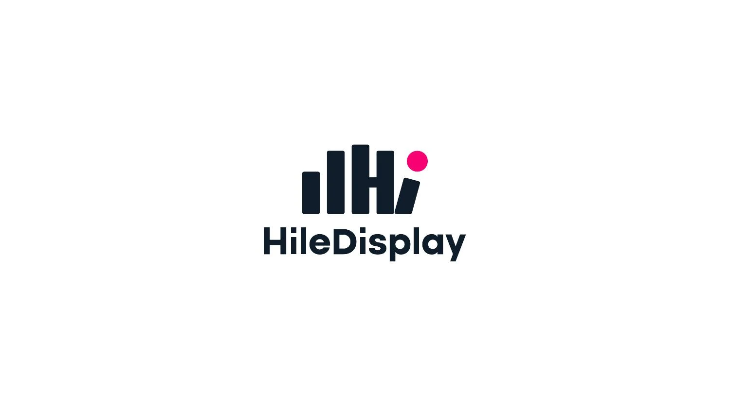
The presented logo uses a compact, upright arrangement with a dot and a hand-like silhouette. Beneath it, the HileDisplay name provides a direct reading. The composition does not attempt to illustrate an entire display product. Instead, it offers a repeatable sign that can identify the company across documents, signage and digital contexts.
This case study draws on the supplied brand-guideline presentation. It covers the rough work, the H/I origin sequence, construction studies, monochrome version, palette and application mockups. It does not claim that every illustrated application was produced, or that the identity achieved a measured sales or recognition result.
02 / HILE Display
The concept: H + I + a human gesture
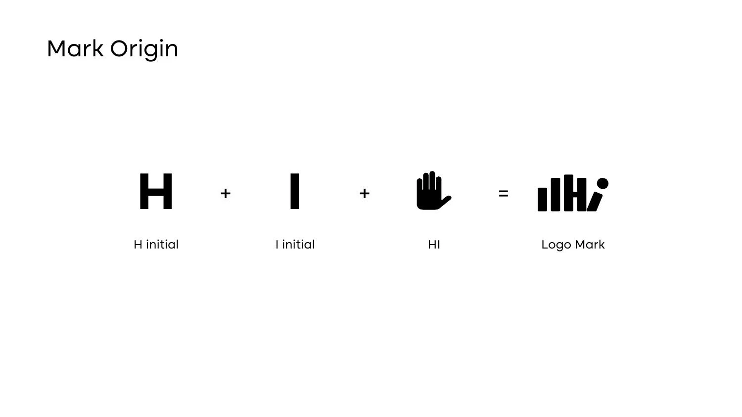
The “Mark Origin” page explicitly connects an H initial, an I initial and a hand-like form with the completed mark. That combination is useful because it joins a name-based idea to a visual gesture. The initials keep the design attached to HILE, while the greeting gives the symbol an additional reading that can be understood without a technical explanation.
The later “Say Hi” presentation makes that second relationship more explicit. It provides a communication device rather than merely a decorative slogan. The identity can acknowledge a viewer, making a business connected with visual presentation feel more human. The concept is simple enough to describe, but it still needs a carefully controlled shape to avoid becoming an ordinary hand icon.
The symbol’s multiple upright elements establish a rhythm. Their heights, gaps and terminal shapes influence whether the viewer sees letters, a hand or an abstract cluster first. A successful synthesis should allow those readings to coexist without making the logo confusing. The source deck records that intent through its concept sequence; our analysis explains how the visual relationships support it.
03 / HILE Display
Sketching before selecting a polished direction
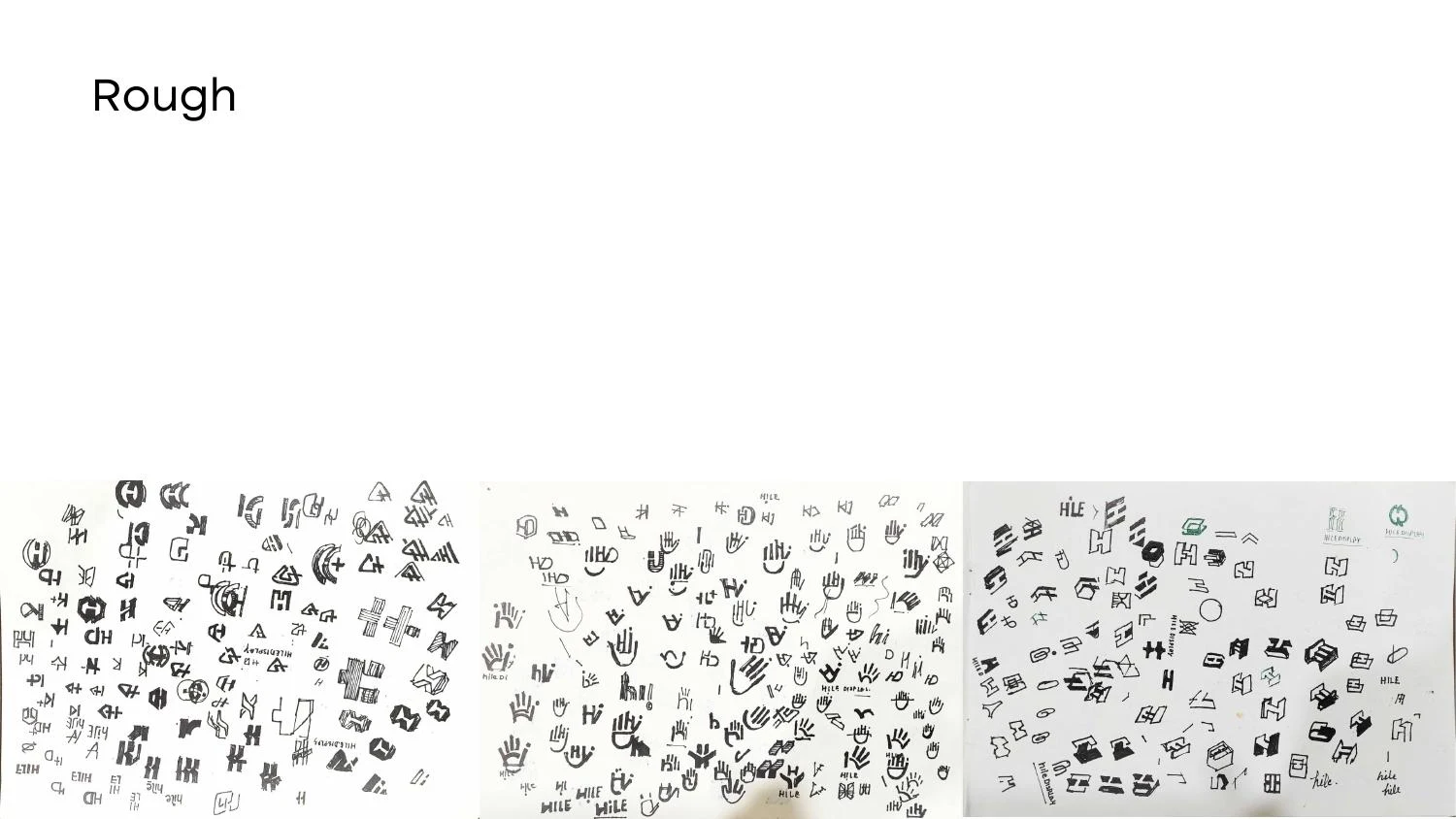
The rough-work page contains a broad field of small studies. This is an important part of the project story because it demonstrates exploration before final presentation. Sketching allows a designer to move quickly between different relationships of letters, gestures and containers without treating every idea as a finished solution.
A productive sketch is not necessarily beautiful. It can expose a structural problem, test a distinctive silhouette or show why a familiar combination is too generic. In a letter-and-hand concept, the drawing must preserve enough anatomy to suggest the gesture while avoiding unnecessary illustration. The useful direction is often found by removing details, not by adding them.
The supplied page is evidence of exploration, but it does not provide a complete chronology or every client response. We therefore show it as a selected rough-work record. The professional point is that the final mark follows a conceptual and visual investigation. We do not invent the number of sketches, hours or rounds needed to reach it.
04 / HILE Display
Geometry, negative space and a stable silhouette
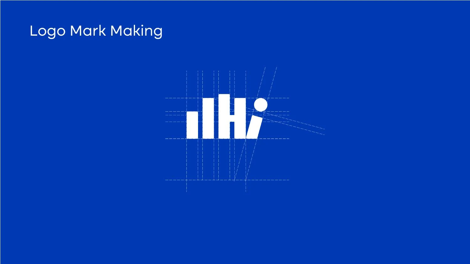
The construction pages show the mark being developed through guides and alignment relationships. Those studies help explain the transition from a sketch to reproducible artwork. A hand-like symbol can easily become uneven: one finger may feel too heavy, an opening may close at small sizes or a rounded lower area may pull the apparent center away from the wordmark.
The solution is not simply to apply a grid and stop looking. Geometric guides provide a useful basis for proportion, but optical balance determines whether the result appears coherent. Curves and flat sides occupy visual space differently. Internal white areas must remain distinct enough to separate the components without breaking the larger silhouette.
Clean vector construction also matters operationally. A filled master should not contain accidental gaps, hidden overlaps or unnecessary points that create export problems. The geometry should be understandable when the mark is enlarged for a sign or reduced for a small digital icon. The source’s construction studies make that concern visible; production files should preserve the approved result rather than rebuilding it from a low-resolution preview.
05 / HILE Display
A modern palette with distinct responsibilities
The guideline palette lists a dark navy ground, a saturated blue and a vivid pink. The dot provides a natural place for an accent, while the primary body can remain stable and legible. This distribution gives the palette an internal hierarchy: not every component has to compete at the same intensity.
The supplied values include #0F1C2A, #0039B4 and #F90072. These are documented palette references from the presentation, not sampled approximations. A real print specification still needs an agreed process, substrate and proofing approach. A bright RGB accent on a screen cannot be assumed to reproduce identically in every physical medium.
The background variations show the identity on light, dark and blue grounds. A usable system defines the appropriate version for each. The accent may remain colored where contrast supports it, while the rest of the mark changes to a light or dark treatment. A monochrome option is also shown. That is an important fallback for situations where color is limited or inappropriate.
06 / HILE Display
The wordmark and the role of readable identification
The HileDisplay name sits beneath the symbol in the core presented lockup. Its direct spelling is important: a compact symbol can become familiar over time, but a new viewer should not have to decode the initials to identify the company. The wordmark supplies that clarity and anchors the more expressive upper shape.
A stacked lockup requires careful spacing between the symbol and name. If the gap is too small, the lower contours can interfere with letter recognition. If it is too large, the two elements lose their connection. The line width and apparent weight of the wordmark also influence the balance. These relationships should be checked at realistic sizes, rather than only in a large presentation.
The source includes an alternate concept page. We keep alternate explorations distinct from the main presented identity. Showing an alternative can help explain a design process, but it should not leave a supplier uncertain about which artwork to use. A final handover should clearly label approved masters, optional variants and archived concept material.
07 / HILE Display
An identity system for documents and interfaces
The deck includes stationery-like applications, a branded pattern and a mobile/app-icon presentation. These studies show how the mark’s visual language can extend beyond a single signature. A supporting contour can add recognition to a larger surface while leaving the primary logo readable and unobstructed.
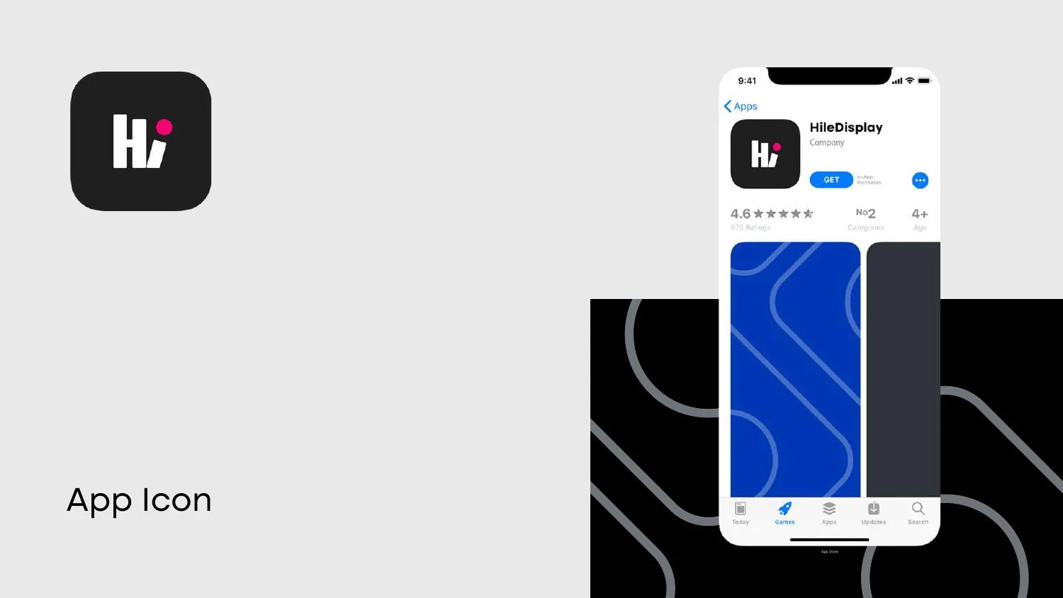
An app icon introduces a different constraint from a business card. Its available area is small, its corners may be clipped by a platform and it often appears among many other icons. A compact symbol is useful, but it needs deliberate internal padding and a clear background. Simply shrinking the entire stacked wordmark can make the name unreadable without improving recognition.
The mobile presentation is an application mockup. It does not establish that Nuo Pixel Solutions built a HILE app or that an app was released. Our broader capabilities include interface and application development, but a case study should keep its project scope precise. Here, the evidence supports identity design, concept development and application presentation.
08 / HILE Display
Testing the greeting without losing the engineering
The most revealing small-size test focuses on the gaps between the upright elements and the relationship of the dot to the main form. If a gap disappears, the symbol’s internal rhythm changes. If the dot becomes too small or too detached, the intended reading can weaken. Those problems should be assessed in the actual exported size, rather than through a zoomed browser preview.
A second check removes color. The hand and letter relationships should still hold in a one-color version, while the palette can continue to add personality where it is available. A third check places the logo beside real information: a contact block, a product image, a technical heading or a navigation bar. Context reveals whether the mark needs more clear space or a different version.
Physical output requires its own proof. A vinyl cut, a printed card and illuminated signage have different limits. These are recommended production checks for a mark of this kind, not a claim that each process was commissioned for HILE. The distinction helps a future client understand both the design quality and the practical work needed to bring an identity into use.
09 / HILE Display
Client review: making a modern identity approachable
The HILE concept creates two useful review questions: does the symbol retain a credible modern character, and does the greeting make it feel approachable? Those aims can pull in different directions if the artwork becomes either too mechanical or too illustrative. The supplied H/I origin page gives the client a clear basis for discussing the relationship rather than choosing solely by surface preference.
The dot is an important part of that discussion. Its position and color influence both the letter reading and the greeting. It should not be moved casually to fit a particular layout. A compact identity often depends on a small number of highly specific relationships; changing one can have more effect than adding a large supporting graphic elsewhere on the page.
In a handover package, the core logo should be separated from the Say Hi messaging and the larger contour pattern. Each has a different job. The signature identifies the company, the message introduces a tone of voice, and the pattern supports composition. Treating them as separate but coordinated assets gives the client flexibility while preserving the original hierarchy.
A useful guideline would identify the primary lockup, compact icon, monochrome option and approved background treatments. It would include actual artwork examples rather than only abstract instructions. Clear-space illustrations should demonstrate how nearby text and imagery can interfere with the silhouette. Minimum-size guidance should follow the most demanding details, particularly the internal separations and the accent dot.
For a new display-sector branding project, discovery should also establish where the identity appears relative to vivid customer content. The mark may sit beside bright photography, moving imagery or complex product demonstrations. That makes a stable monochrome option and controlled background treatments especially valuable. These are practical considerations for extending the presented concept, not an assertion that a particular screen installation or campaign was delivered as part of the HILE project.
10 / HILE Display
What the HILE Display case brings together
HILE Display demonstrates a useful balance between a conceptual idea and a controlled drawing. The H/I relationship grounds the mark in the name. The hand-like greeting adds personality. Sketches and construction studies connect the concept to the final shape, while the background variants and applications show how it can operate as a system.
For a new branding project, the lesson is to make the concept earn its place in the artwork. An attractive explanation is insufficient if the mark is hard to use. Equally, a geometrically tidy drawing can feel empty if it has no relationship to the brand. The best work brings meaning, optical refinement and application requirements into the same conversation.
Nuo Pixel Solutions works across that conversation, from research and early sketching to vector refinement, visual identity and digital implementation. This case shows the design discipline behind a compact identity. The accompanying source presentation allows visitors to examine the actual material instead of relying only on a description of the finished logo.
Explore the original design presentation
The selected artwork above is optimized for reading on this page. The original supplied presentation is also available from our WordPress Media Library. It provides the wider visual context, including concept explanations, identity variations and application studies. Where the source shows alternate concepts, those remain explorations rather than an instruction to mix different logo versions.
Application mockups communicate a design direction. Before commissioning physical output, confirm the approved master files, final specifications and requirements of the chosen production process. The analysis here distinguishes the presented work from recommended checks and does not invent commercial results or client quotations.
Practical questions
HILE Display case study FAQs
How was the HILE Display concept developed?
The supplied guideline deck connects H and I initials with a hand-like gesture, and includes rough sketches and geometric construction studies.
Why is there a monochrome version?
It provides a usable option when color is unavailable or when the application needs a simpler, more controlled treatment.
Does the app-icon mockup mean an app was developed?
No. It demonstrates an identity application; this case does not claim software development for HILE.
Nuo Pixel Solutions / Since 2015
Give your brand a clear, distinctive identity.
Tell us about your business, audience and the places your identity needs to work. We can help with research, concept development, sketching, illustration, logo lettering, vector refinement and a coordinated visual identity.