Brand identity / Concept · craft · application
JUQIFAB: Gather One: precision expressed through convergence.
Our JUQIFAB logo concept brings directional forms into one center, linking the supplied “Gather One” philosophy with initials, modular geometry and an industrial visual identity.
Nuo Pixel Solutions · Design by Nitin Singh · Design and technology since 2015
01 / JUQIFAB
A manufacturing philosophy becomes a visual brief
The JUQIFAB presentation defines the core idea as “Gather One”: bringing strengths, resources and expertise into a focused result. Nuo Pixel Solutions used that supplied brand philosophy as the basis for an identity built around convergence. Rather than depicting a machine or a finished part, the symbol makes the relationship between multiple elements and one center visible.
The source connects the concept to “Ju Qi Yi” and the Chinese text 聚柒一. We treat that as the brand interpretation documented in the supplied design presentation, rather than making an independent linguistic claim. Its practical value for the design is clear: gathering becomes a spatial relationship that can be expressed through direction, alignment and controlled negative space.
This case covers the concept, letter studies, lens analogy, symbol construction, lockups, palette and application mockups. It documents Nuo Pixel Solutions’ identity work. It does not imply that we developed JUQIFAB’s manufacturing network, operated its equipment or verified the production claims that appear as sample content inside the deck.
02 / JUQIFAB
Several forms, one center
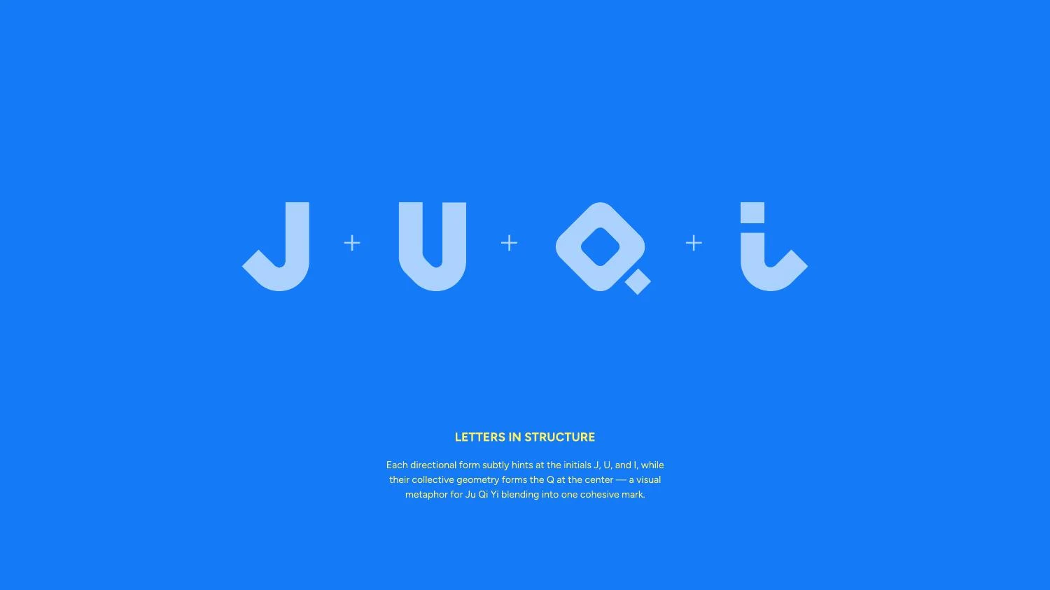
The symbol consists of directional components arranged around a central space. Each part has its own contour, but the collective arrangement is the identifying mark. That distinction is important: the concept is not simply a collection of arrows. It is a relationship in which the parts appear to focus toward the same point.
The presentation links component shapes with initials and describes a central Q relationship. The letter sequence is shown as part of the concept argument. A viewer does not need to decode every initial for the mark to function; the recognizable silhouette and convergence can carry the first impression. The deeper explanation connects the visual structure back to the name and philosophy.
A modular mark needs enough variation to avoid feeling like a generic repeated icon. It also needs enough consistency to read as one system. The JUQIFAB structure negotiates that balance through its directional shapes, repeated angular relationships and central opening. The central space is an active design element, not unused background.
03 / JUQIFAB
The lens analogy explains focus
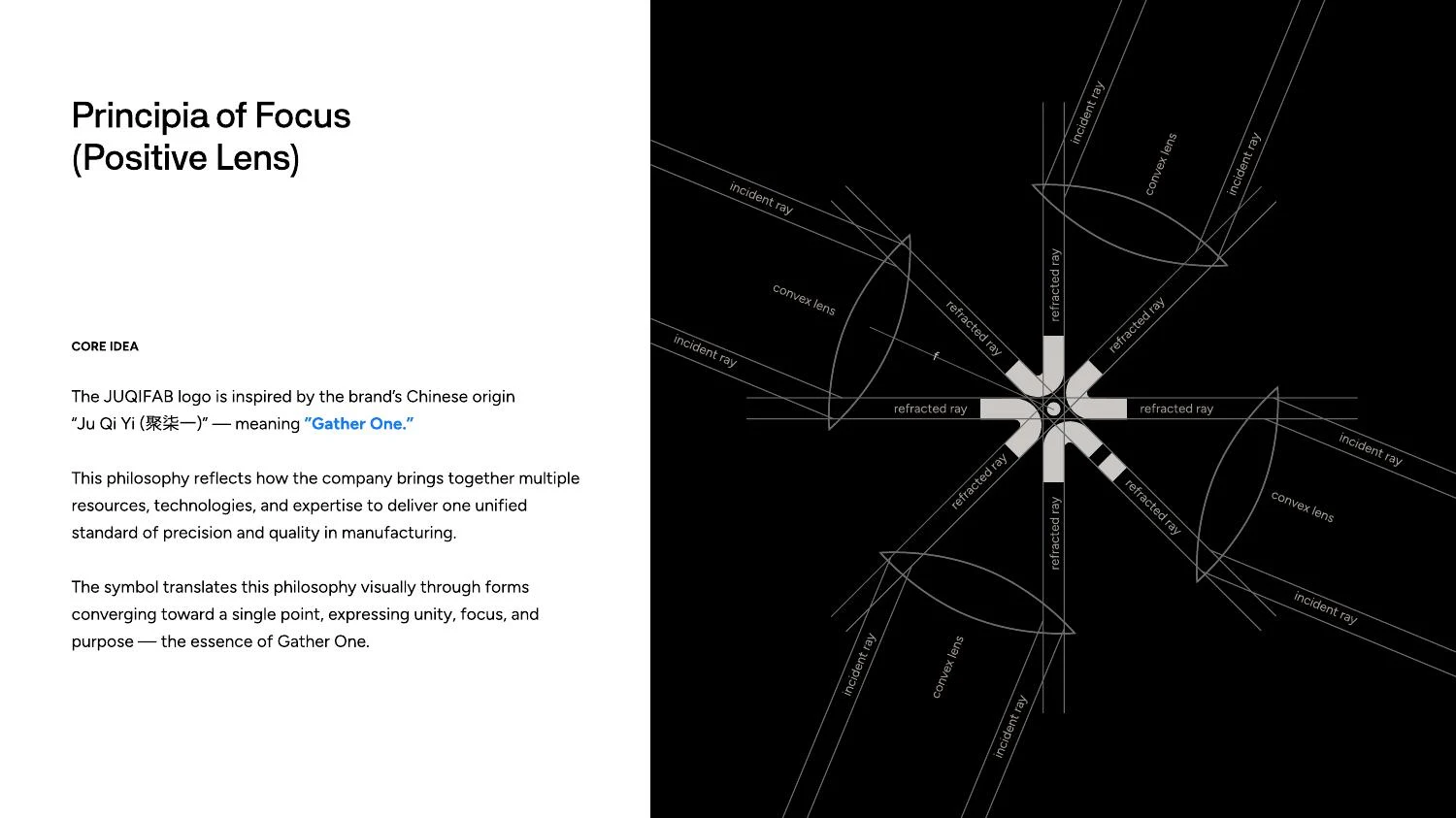
One of the supplied pages uses a positive-lens diagram to explain focus. Multiple paths converge toward a point, providing a visual analogy for the brand’s gathering concept. It is a conceptual bridge between the business story and the geometry of the logo, not a claim that the symbol is an optical instrument or an engineering calculation.
That distinction protects the quality of the explanation. A technical metaphor should clarify a design decision rather than borrow scientific authority that the artwork does not need. Here, the lens reference helps a client understand why the directional forms converge. The logo then abstracts that relationship into a compact shape suitable for identification.
The analogy also provides a useful review criterion. If the components appear to scatter rather than gather, the drawing contradicts its own story. Alignment, orientation and the central gap should therefore be examined together. The concept gives the refinement a purpose: every contour should contribute to the sense of controlled focus.
04 / JUQIFAB
Modular construction and optical judgment
Repeated elements can create the impression that a mark is easy to construct. In practice, the meeting point is often the most demanding area. Small changes in component angle or spacing can make the center feel crowded, create accidental shapes or give one side more visual weight than another.
A grid supplies a repeatable framework, while optical correction evaluates the filled result. Narrow gaps should remain open at the intended small-use size. Corners should be deliberate rather than artifacts of overlapping shapes. The overall silhouette should feel balanced beside the wordmark, even when the internal components are not individually symmetrical.
The source deck includes construction-oriented presentations, but it does not supply a production drawing with manufacturing tolerances. A logo is visual communication; its geometric discipline should support recognition and reproduction. We avoid inventing a mathematically exact generative formula or a golden-ratio claim that is not established by the material.
05 / JUQIFAB
A precise wordmark beside an active symbol
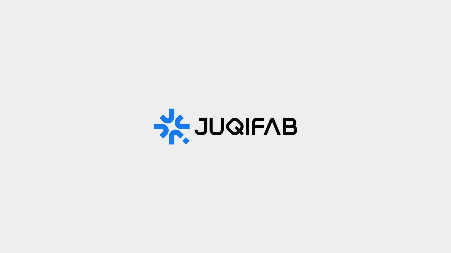
The JUQIFAB wordmark gives the converging symbol an explicit name. The contrast between the compact emblem and the longer lettering creates a useful horizontal composition. The emblem attracts attention; the wordmark identifies the company. The two must be judged as a lockup, not merely as separate attractive elements.
Spacing and relative size have practical consequences. A symbol that is too large can overpower the name, while one that is too small can lose its internal openings. The distance between them should keep the forms distinct without making them feel unrelated. At reduced sizes, wordmark legibility and symbol detail may reach their limits at different points.
A complete identity system can therefore define more than one use: a full name-and-symbol lockup, a compact symbol where the brand is already established, and appropriate reversed or one-color versions. The deck shows multiple presentations of the identity. A final guideline should state which is primary and when each alternative is appropriate.
06 / JUQIFAB
Blue, black and light grounds
The supplied blue identity uses a vivid blue with dark and light neutrals. The palette page records HEX #147AF8, #000000 and #EDEDED. One label calls the blue “Neon Orange,” even though its HEX value and the visible artwork are blue. We identify the color by the value and appearance shown, and treat the inconsistent label as something to correct before a final production guideline is distributed.
The light symbol on blue and the blue symbol on a light background have different visual effects. The first makes the field a strong brand asset; the second gives the symbol a more localized emphasis. A black-ground presentation supports another application context. Clear version rules keep those options from turning into arbitrary color changes.
Technical handover should also normalize the specification format. RGB channels are normally expressed as three values, while opacity is a separate property; print values should match the chosen production workflow. The deck’s mixed formatting is a reason to verify the master specifications, not to copy them uncritically into a supplier package.
07 / JUQIFAB
The identity as a repeatable industrial language
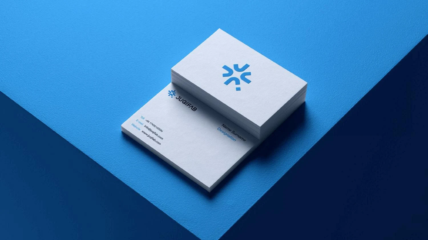
The presentation extends the symbol into business cards, vehicle graphics, a flag, an app icon and large environmental surfaces. A repeated or enlarged component can create a supporting pattern, giving the identity a recognizable texture beyond the full logo. This is particularly useful when a large surface needs presence without becoming a wall of repeated wordmarks.
A manufacturing brand also needs room for practical information. Technical specifications, contact details, capabilities and project imagery should remain readable. Supporting graphics need to frame that content rather than compete with it. A disciplined visual system makes it possible to create different compositions while retaining a common identity.
These scenes are application mockups. They demonstrate scale, color and placement, not verified vehicle wraps, installed flags or a released app. Physical production would require separate artwork preparation and supplier review. We keep the case focused on what the source actually documents: a concept-driven logo and a developed presentation of its identity system.
08 / JUQIFAB
Production checks for a converging mark
The central convergence is the first place to inspect during reduction. If the narrowest gaps merge, the symbol can turn into a less distinctive mass. A minimum-use size should be based on actual output, with separate consideration for screen rendering, print and material processes. A high-resolution preview alone does not establish that an embroidered or engraved version will remain clear.
A one-color review asks whether the structure remains recognizable without the blue field. Reversed use should also be inspected independently, because light forms on dark grounds can appear fuller. Clear space should protect the outer silhouette, especially when the logo appears beside technical drawings or other visually dense material.
File preparation should distinguish the master mark, wordmark lockups, supporting patterns and concept illustrations. A lens diagram is explanatory material, not part of every logo application. A component used as a large pattern should not be mistaken for a replacement signature. Clear naming and a concise usage guide help other teams preserve that distinction.
09 / JUQIFAB
Client review: a concept with operational clarity
The Gather One idea gives the client a useful way to assess the proposal. A review can ask whether the mark feels focused, whether the individual components read as a coordinated whole and whether the name remains clear beside the emblem. Those questions are more constructive than treating precision as a vague visual style.
The central opening deserves particular attention. Its shape is part of the convergence story and part of the mark’s small-size behavior. If a supplier thickens the components or changes their spacing to accommodate a production method, the center can change significantly. Any specialized production variation should therefore be deliberately prepared and approved, rather than edited informally from a preview image.
A final asset package should distinguish the primary identity, compact symbol, supporting component patterns and explanatory concept diagrams. The lens analogy helps tell the story, but it is not a mandatory background for every application. The modular pattern can add recognition, but it should not compete with the full signature on a document containing dense technical information.
The specification review also has a clear operational purpose. The blue label, channel formatting and output values should be normalized before the guideline becomes a supplier reference. That work is part of professional identity development: a visually persuasive deck and a technically dependable production package serve different stages of the same project. Both should be clear about which version is authoritative.
For a similar manufacturing-brand commission, we would establish the business proposition, product and service range, dominant applications and existing assets before exploring symbols. The brief would clarify the role of multilingual naming, the expected balance of emblem and wordmark, and the production files required. This turns a broad ambition such as unity or precision into concrete design decisions that a client can evaluate and a production team can apply.
10 / JUQIFAB
Why the concept is useful beyond the presentation
The strongest aspect of the JUQIFAB direction is that its story and construction reinforce each other. Gathering is expressed through orientation and proximity, not added as an unrelated slogan after the drawing is finished. The initials provide an additional connection to the name, while the compact silhouette allows the mark to function without a full explanation.
For an industrial client, the lesson is to define the central brand proposition before selecting a fashionable visual style. Precision can be expressed through spacing, consistency and control rather than a stock gear. Integration can be expressed through how parts relate to one another. A relevant concept gives the designer practical criteria for refinement and gives the client a clearer basis for evaluation.
Nuo Pixel Solutions develops that relationship from early ideas through artwork and application systems. This case demonstrates concept synthesis, modular drawing, typographic balance and technical scrutiny of the source specifications. It also shows why professional handover includes reviewing labels and values: the identity should be both persuasive to look at and dependable to use.
Explore the original design presentation
The selected artwork above is optimized for reading on this page. The original supplied presentation is also available from our WordPress Media Library. It provides the wider visual context, including concept explanations, identity variations and application studies. Where the source shows alternate concepts, those remain explorations rather than an instruction to mix different logo versions.
Application mockups communicate a design direction. Before commissioning physical output, confirm the approved master files, final specifications and requirements of the chosen production process. The analysis here distinguishes the presented work from recommended checks and does not invent commercial results or client quotations.
Practical questions
JUQIFAB case study FAQs
What does Gather One mean in this case?
It is the brand philosophy recorded in the supplied JUQIFAB presentation: multiple strengths and resources converge into a focused result.
Is the logo based on an optical formula?
The deck uses a lens analogy to explain convergence. It is a design metaphor, not a claim that the logo implements an optical calculation.
Why is a blue color labeled Neon Orange?
That is an inconsistency in the source deck. The visible color and HEX #147AF8 are blue; a final guideline should correct the label and normalize the specifications.
Nuo Pixel Solutions / Since 2015
Give your brand a clear, distinctive identity.
Tell us about your business, audience and the places your identity needs to work. We can help with research, concept development, sketching, illustration, logo lettering, vector refinement and a coordinated visual identity.