Our work / WayZao logo & visual identity
WayZao: a wave that becomes a brand signature.
We brought W, A and Y together with a wave, then carried that idea into the wordmark, visual identity and reveal. Here is how we developed the design.
Nuo Pixel Solutions · Design by Nitin Singh · Since 2015

01 / WayZao
A manufacturing brand with a clear sense of direction
For WayZao, we wanted the identity to express more than a company name. The brand needed a clear visual idea that connected precision manufacturing with the journey from an initial requirement to a finished result. Our starting point was the meaning carried by “Way”: a direction, a method and a route through a process. We brought that thinking into an identity designed around the message “Your Way to Precision Manufacturing.”
We framed the brand as a process-driven solution provider. That distinction shaped our decisions. Rather than filling the logo with machinery, cutting tools or an elaborate industrial illustration, we looked for a concise visual relationship that could express how the business works. The mark needed enough character to be recognizable, while the name needed to remain clear in the practical situations where a manufacturing company introduces itself.
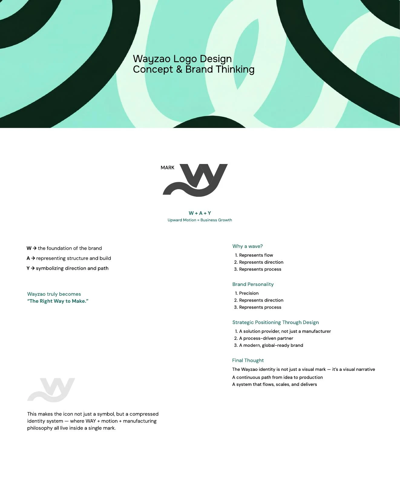
Our answer brings W, A and Y together with a wave, connecting the identity with the idea “The Right Way to Make.” The concept lives in a compact mark and continues into the WAYZAO wordmark. The resulting identity has two complementary strengths: a name people can read and a distinctive movement they can recognize.
02 / WayZao
W + A + Y: three ideas within one mark
We developed the concept around three letters with different roles. W provides the foundation and the direct connection to the brand name. A introduces structure and the idea of building. Y adds direction and a path forward. We explored those relationships together, looking for a form that could carry the name’s character without becoming a diagram that required explanation every time it appeared.
This combination gave us a useful design constraint. Each letter had to contribute to the larger shape; none could feel like an unrelated element placed beside the others. We worked with the relationship between upright structure, diagonal movement and a more fluid lower gesture. The aim was to connect the parts into one visual idea, rather than ask three separate initials to compete for attention.
At the first level, the mark reads as a compact brand signature. At the next, its letter relationships reveal the reasoning behind it. We value that sequence: recognition first, explanation second. A logo should remain useful on a small application even when there is no room to reproduce the full concept story.
03 / WayZao
Why we used a wave
The wave gives the identity a sense of flow. For this project, we connected that flow with direction and process: the movement from an idea into a structured manufacturing journey. It allowed us to express continuity without drawing a literal road, a machine or a sequence of production stages inside the logo.
A wave can also become too decorative if it has no structural role. We therefore treated it as part of the mark’s construction and the wordmark’s personality. Its change of direction creates a relationship between the more angular letterforms and the softer connecting gesture. The movement should feel deliberate, with enough control to belong to a precision-focused business.
Our concept exploration also uses upward movement as a symbol of progress. That is a design intention, not a claim about a measured business outcome. Within the identity, the important relationship is between movement and control. We wanted the brand to feel capable of guiding a process forward while retaining the clarity and discipline expected from a manufacturing partner.
04 / WayZao
From the mark to the WAYZAO wordmark
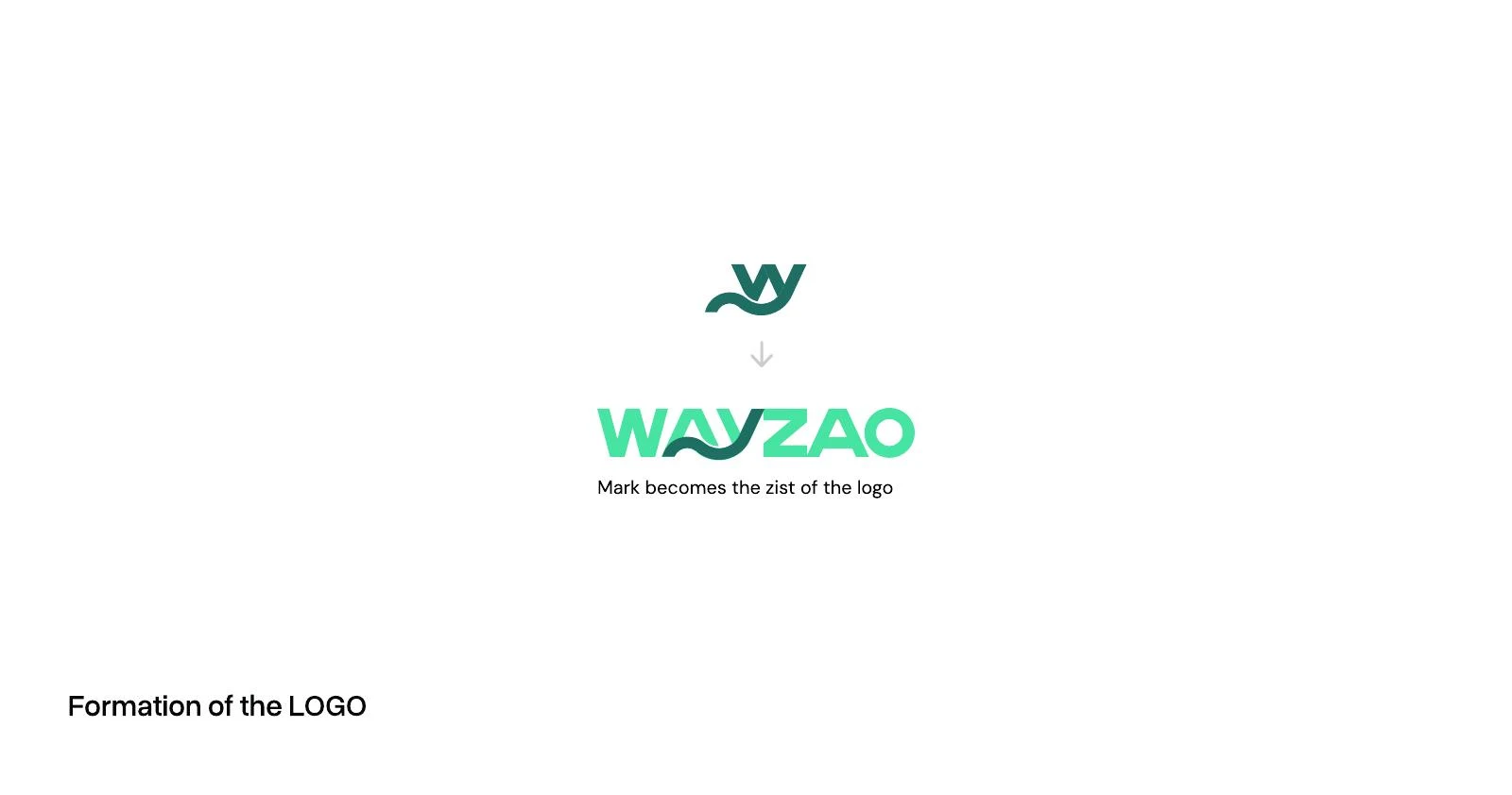
The next step was to carry the concept into the full name. We did not want the mark to tell one story while ordinary lettering beside it told another. In our formation studies, the wave becomes a defining part of the wordmark itself. The relationship around A and Y is especially important: it introduces the flowing gesture without losing the rhythm of the name.
This is where the identity becomes more specific to WayZao. The full WAYZAO wordmark is a primary expression of the design, rather than an interchangeable caption beneath a standalone W. Its recognizable character depends on the interaction between the letters, the curve and the spaces around them. The compact mark then provides a related option when the full name would not fit comfortably.
We kept that relationship visible in our presentation. Showing the formation of the logo makes it easier to understand how the conceptual work becomes an actual signature. The design can be explained through its parts, but the final reading needs to feel unified. A viewer should encounter WayZao as one name, not stop to assemble a collection of symbols.
05 / WayZao
Lettering: expressive detail with a readable name
We balanced the flowing section with firmer letter construction elsewhere in the wordmark. The W establishes a strong opening, while Z, A and O give the latter part of the name a clear geometric rhythm. The rounded ending provides a different kind of closure from the sharper diagonals earlier in the word. These contrasts help the signature hold together without making every letter identical in character.
The relationship between A and Y required particular attention. A distinctive connection can become a weakness if it makes the name difficult to read. We evaluated the letter shapes as a word, considering where the eye moves, how the internal spaces separate the forms and whether the curve supports the reading instead of interrupting it.
This is logo lettering: a fixed name refined as a repeatable piece of artwork. We treat its spacing, contours and proportions as part of the identity. Stretching the exported logo or changing one letter independently would alter those relationships. Where supporting text is needed, it should have its own typographic role rather than attempt to reproduce the logo’s custom details throughout a document.
06 / WayZao
Turning the drawing into controlled vector artwork
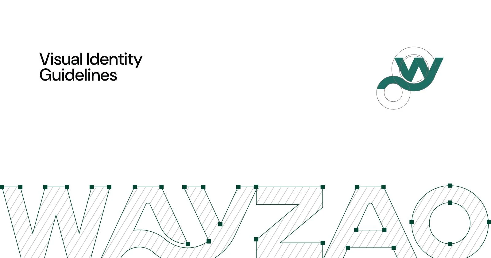
Our construction board shows the wordmark through its paths, anchor points and curve relationships. We use this stage to make the expressive idea dependable. A curve that looks smooth in a small sketch can reveal an awkward transition when enlarged. A narrow opening can disappear when the same drawing is reduced. Refinement has to account for both situations.
We look at optical balance alongside geometry. Equal measurements do not always produce equal visual weight: an enclosed rounded form can feel different from an open diagonal, and a curved connection can gather more apparent weight than a straight section. The finished silhouette needs to read coherently, rather than merely satisfy a grid.
We also want the artwork to remain clean when it moves between formats. The shape should be defined by deliberate paths and a manageable set of points. That makes the approved contour easier to reproduce in digital assets and production files. The construction presentation is useful because it opens up this part of the craft: the identity is an intentional drawing, with decisions that remain visible beneath the finished color.
07 / WayZao
What our working sketches reveal
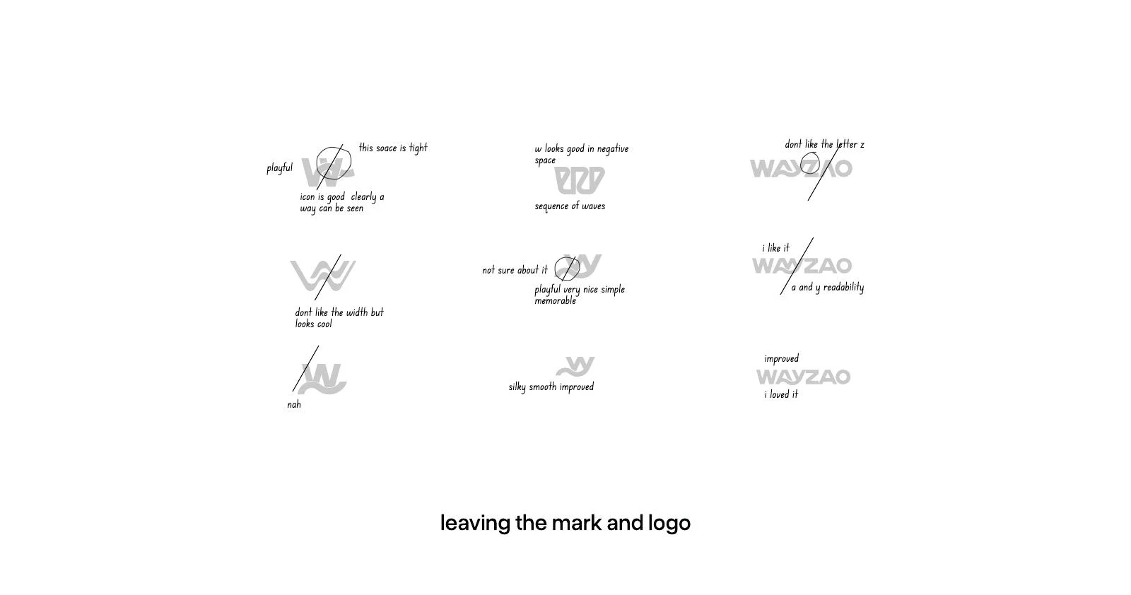
Our sketch and refinement sheet records the questions we asked while developing the direction. Some studies test a more playful gesture; others simplify the mark or change the proportions of the word. Notes about width, negative space, tight spacing and A/Y readability show how the evaluation moved between concept and practical reading.
We kept those questions active during refinement. A shape can feel memorable while still being too wide. A compact arrangement can solve one layout problem and create a tight internal space somewhere else. A clever negative-space reading may be worth exploring without becoming the final answer. Sketching lets us compare those tradeoffs before the drawing becomes too polished to question.
The working sheet also shows progression. We return to promising relationships, smooth the drawing and reassess the name. That is a more useful account of our process than presenting the finished logo as an isolated flash of inspiration. The final identity grows through observation, comparison and selective improvement, with the concept and the legibility of the name considered together.
08 / WayZao
Color: a consistent core and room to explore
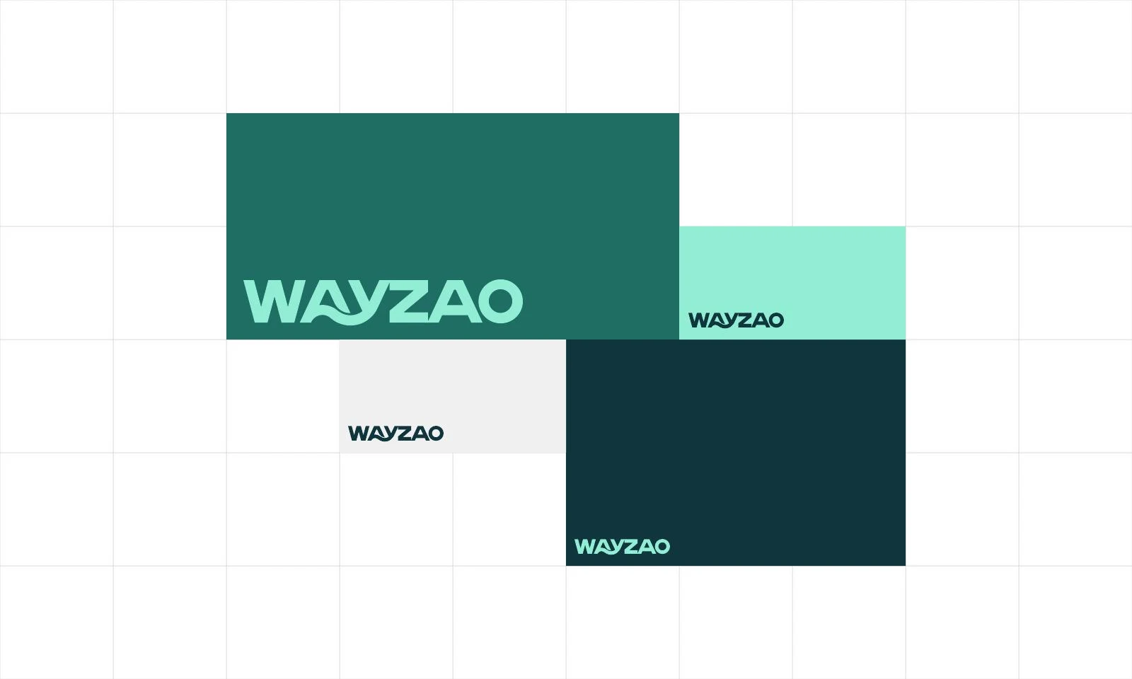
We developed the identity in teal and green relationships, pairing the mark with deep dark grounds, mint accents and light backgrounds. Those combinations allow the signature to shift emphasis: the color can sit in the logo, in the surrounding field or in supporting brand graphics. The underlying letter relationships stay consistent as the background changes.
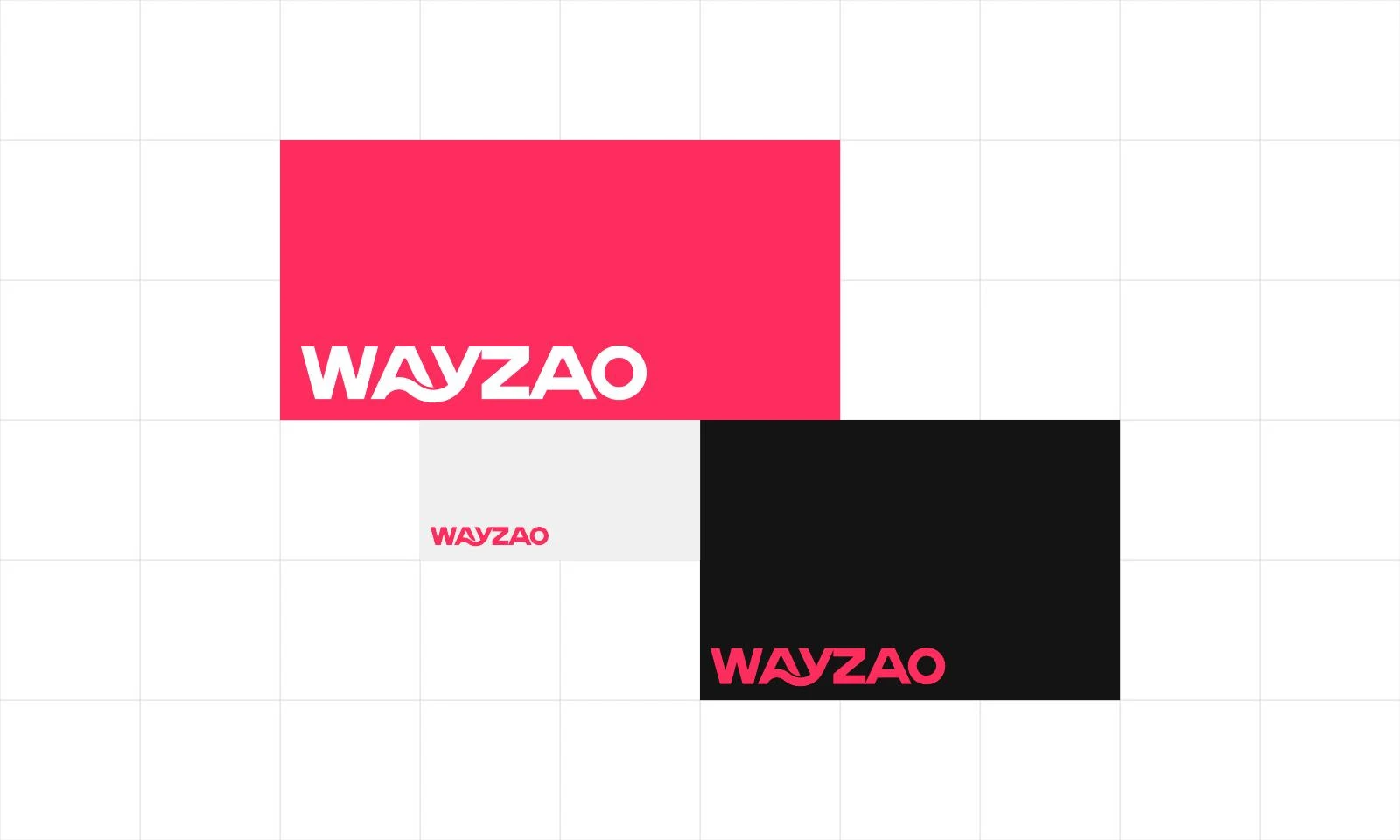
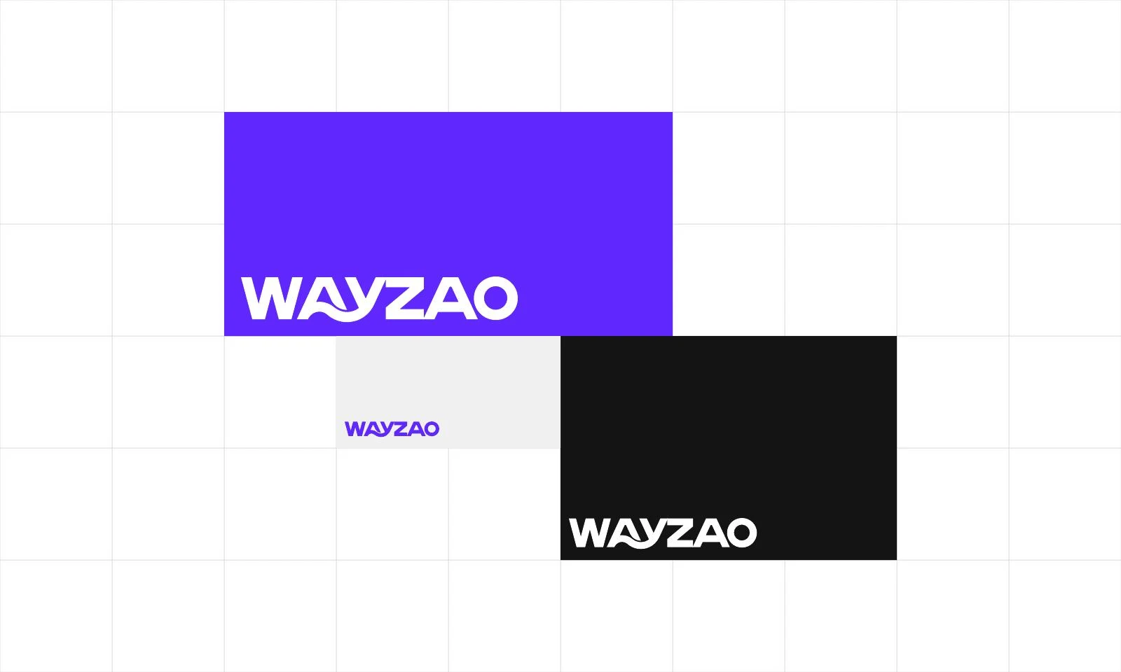
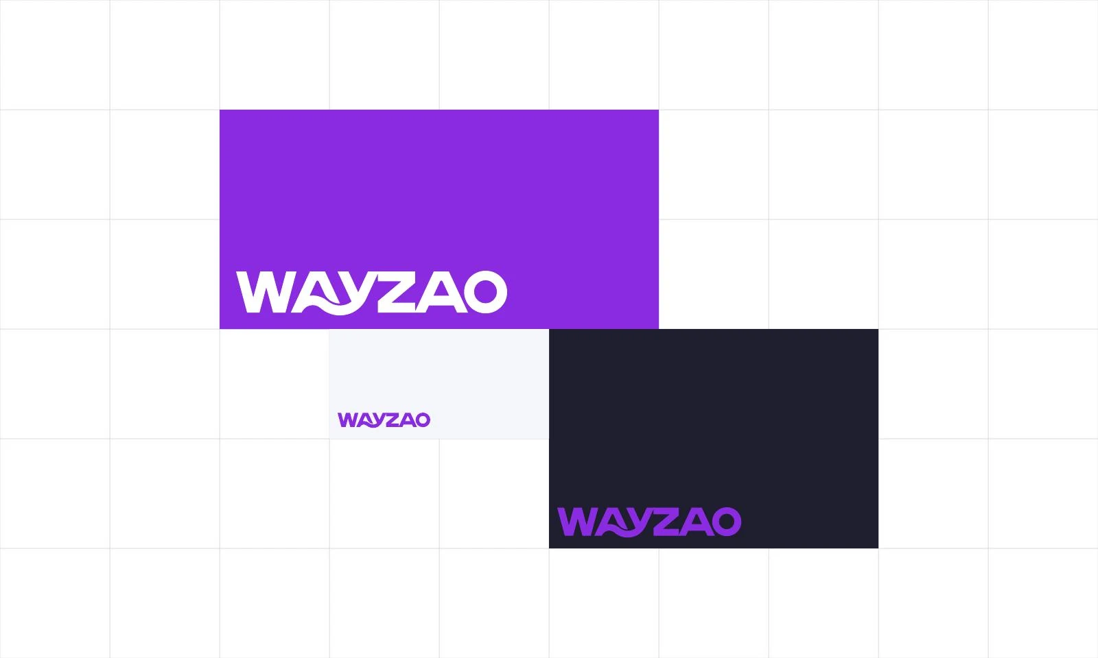
Our color studies also explore red-pink, blue-violet and purple directions with dark and light counterparts. We present them as color explorations, so the development work remains clear. A palette study is a way to compare personality and application behavior; it does not mean that every variation should be mixed into the same brand communication without a defined role.
For us, the important design question is how color supports the same recognizable form. We consider the full wordmark, the compact mark, a reversed treatment and a one-color version together. A useful identity should have a clear application hierarchy, with enough flexibility for different surfaces and enough consistency that people continue to recognize the brand.
09 / WayZao
A visual language beyond the signature
We extended the curve into a broader visual language. Enlarged, cropped or repeated, it can create movement across a page without requiring the full logo to appear everywhere. That gives the identity a supporting system for layouts, covers and other brand surfaces while keeping the primary signature clear.
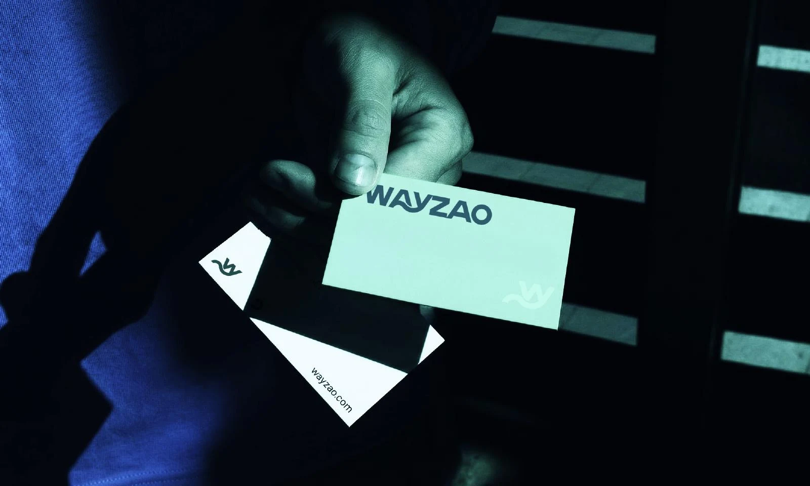
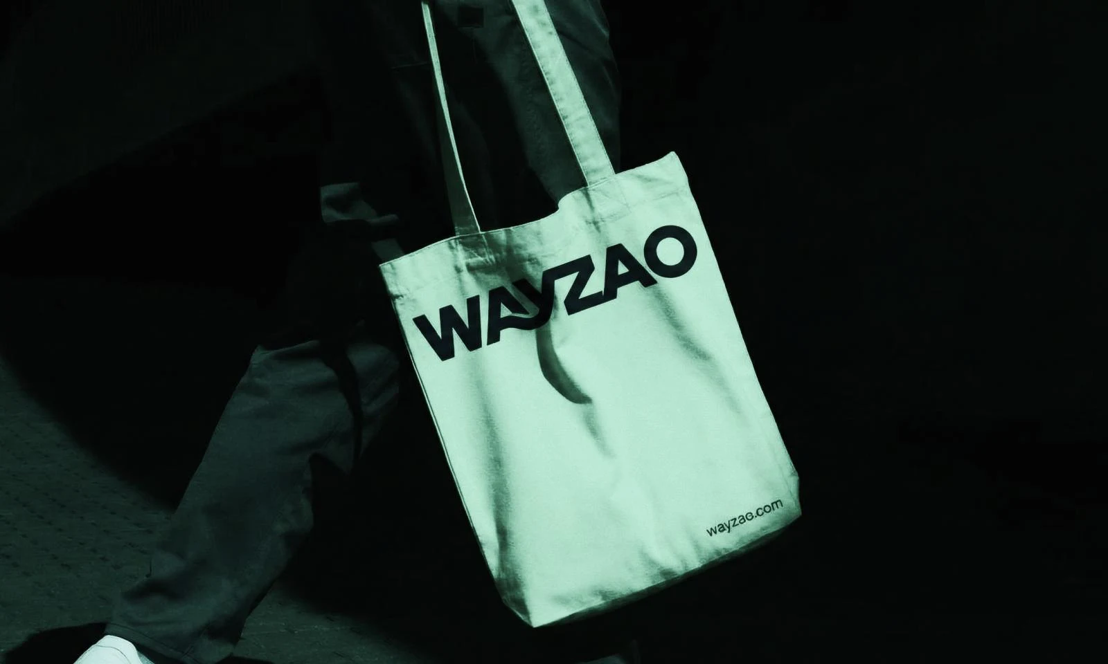
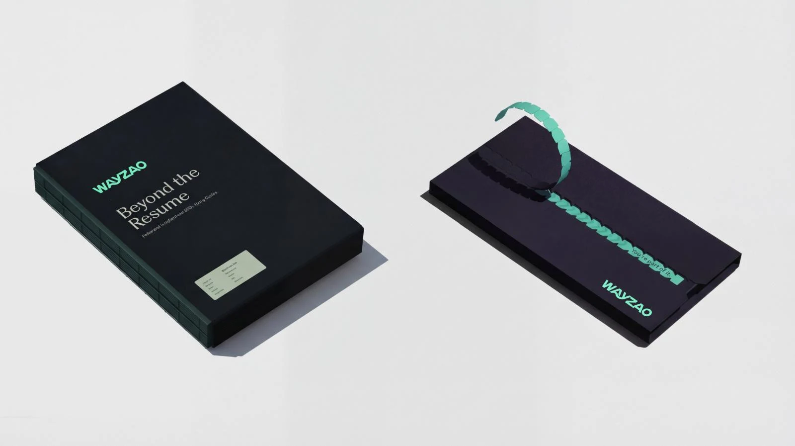
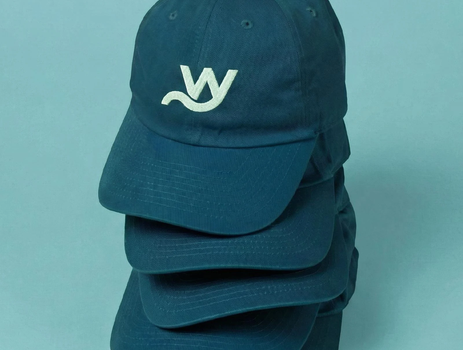
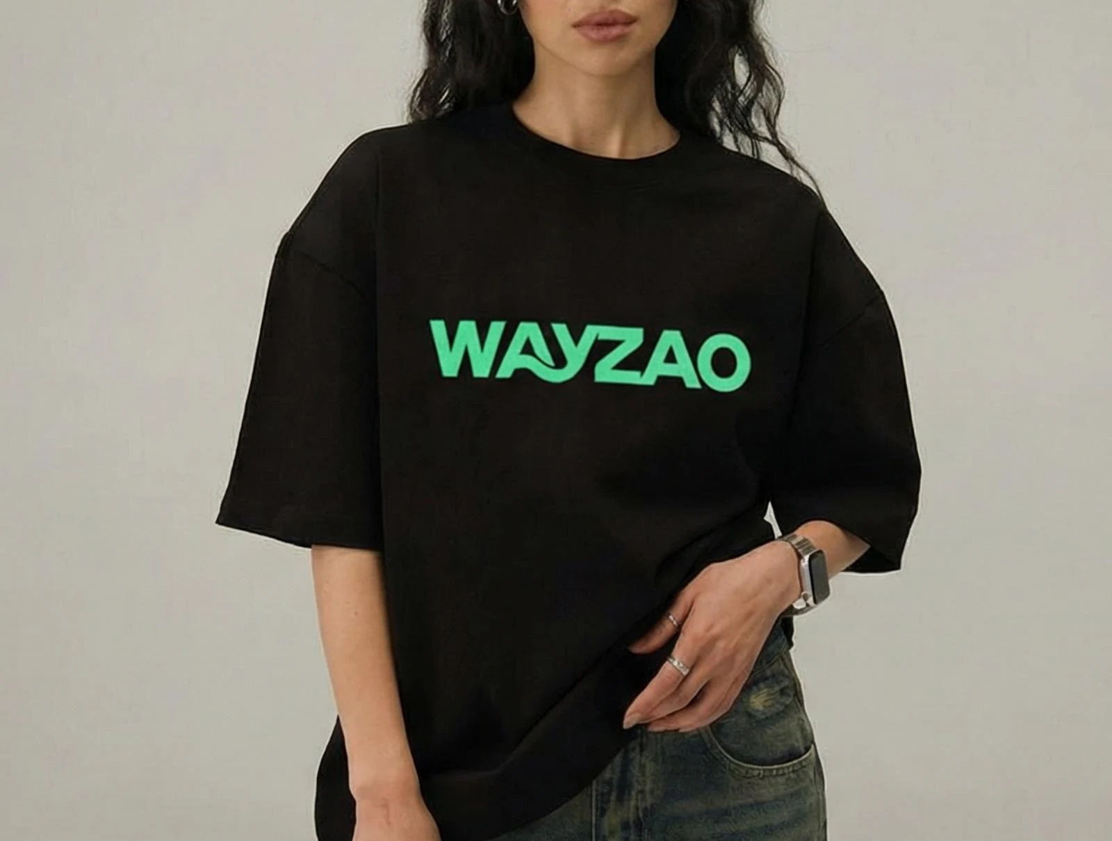
Our application studies include business cards, a bag, a branded cover, an identification-card layout, a cap and a T-shirt. Each gives us a different way to examine proportion and hierarchy. A card shares space with information. A cap needs a compact identifying element. A larger garment allows the full name to become a stronger feature. We use these studies to see whether the same idea can remain coherent across those different demands.
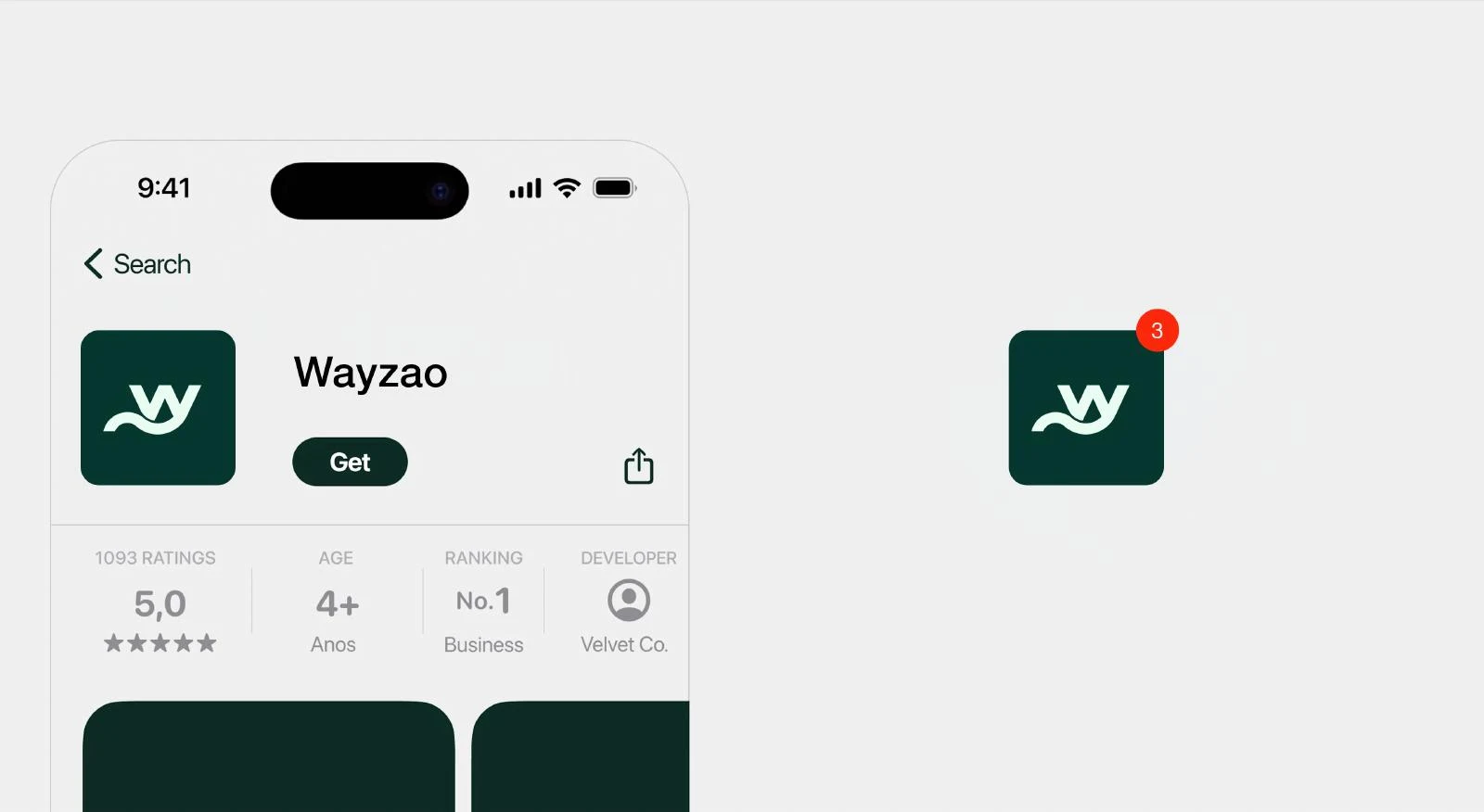
The app-icon study introduces another useful scale. A compact mark can work in a square area where the full wordmark would become too small to read. We show these applications as identity mockups: they make our design direction tangible and help explain its range. Their purpose here is to demonstrate the visual system, rather than document manufactured items or a software release.
10 / WayZao
The reveal: make the concept visible in motion
The reveal introduces the identity through the same central idea. A line moves into a wave, changes its rhythm and passes through a sequence of color transitions before resolving into the WAYZAO wordmark. The motion brings attention to the relationship between flow and letterform, so the reveal feels connected to the identity rather than added as a separate effect.
We use motion to pace that explanation. The initial line offers a simple point of attention; the changing contour introduces energy; the final wordmark gives the sequence a clear destination. The finished name remains the identifying result. This is particularly useful when a logo first appears in a presentation, a brand introduction or a digital project story.
On this page, the reveal plays only when you choose to start it. The poster shows the final wordmark, and the video controls let you pause, replay or adjust the sound. The static artwork and the written concept remain available alongside it. The identity should still make sense when someone prefers to study the drawing without motion.
11 / WayZao
Keeping the identity consistent in use
A strong concept needs clear application decisions. We consider the full wordmark and compact mark as related assets with different uses. Where the name needs to be introduced, the full signature gives the viewer a direct reading. Where space is limited and the context already identifies the brand, the compact mark can provide a more economical presence.
We preserve the relationships that make the drawing distinctive: the proportion of the letters, the wave connection, the internal openings and the spacing around the mark. Background choice and clear space should help those details remain visible. A layout should adapt to the identity rather than stretch or compress the artwork to fill an arbitrary box.
Production also calls for practical choices. A digital interface, a printed card and a stitched application have different constraints. We use the identity system as a consistent starting point and prepare the relevant version for its destination. That is how the design moves beyond a presentation: the idea stays recognizable while its application responds to the medium.
12 / WayZao
What we brought together for WayZao
The WayZao work combines concept development, custom logo lettering, vector refinement, color exploration, application design and a motion reveal. The W/A/Y relationship gives the identity its reasoning. The wave gives it movement. The full wordmark brings those decisions into a name that can act as the main brand signature.
For us, the strongest part of the project is the connection between the explanation and the drawing. The manufacturing proposition does not depend on inserting a machine into the logo. It is expressed through direction, structure, flow and control. Those ideas give the identity a point of view while leaving room for the client’s products and technical information to carry their own detail.
At Nuo Pixel Solutions, we bring artistic exploration and technical discipline into the same process. Since 2015, our work has connected identity design with digital experiences and software development. For a branding project, that means thinking from the first sketch through the way an asset will be presented, reproduced and used. WayZao is a clear example of that approach: one concept developed into a coherent visual language.
Explore the work
Our identity development and color studies.
See the concept, lettering, application mockups and palette explorations together in our full presentations.
A closer look
WayZao logo design FAQs
What is the idea behind the WayZao logo?
We combine W, A and Y with a wave: W gives the brand its foundation, A brings structure and building, and Y introduces direction and a path. The wave connects those ideas through flow and process.
Why does the wave continue into the wordmark?
We wanted the concept to live in the actual name, not only in a separate icon. Its relationship with the A and Y gives the WAYZAO wordmark a distinctive connection to the compact mark.
What do the sketches show about our process?
They show us testing the letter relationships, width, negative space and readability. We refine promising ideas through comparison rather than treating the first polished drawing as the final answer.
Are all the color combinations one final palette?
The page distinguishes our teal/green presentations from the additional color studies. We use those studies to explore expression and background behavior while keeping the logo structure consistent.
How can this kind of logo support a broader brand identity?
A clear signature can establish the visual foundation. We then extend its geometry, color relationships, typography and motion into a coordinated set of applications, so the brand remains recognizable as the context changes.
Nuo Pixel Solutions / Since 2015
Let’s find the idea behind your identity.
Tell us about your business, your audience and where your brand needs to work. We can help you connect research, sketching, logo design, illustration, lettering and a coherent visual identity.