Nuo Pixel Solutions / Logo design & visual identity / Since 2015
Logo design.
Meaning in
every mark.
Artistically considered. Technically resolved. We turn your business story into an original logo and a visual identity that people can recognize, understand and use.
We begin with your input, research your market, sketch ideas by hand and develop a concept worth refining. From a custom-drawn wordmark to a complete visual system, every decision connects the brand’s character with the way it will appear in the world.
The final mark is the visible result. The thinking, sketching and careful construction give it a foundation.
01 / Selected logo design work
Different brands.
Distinct visual voices.
Wordmarks, symbols, lettering and illustrated identities from our work. Open any image to inspect it more closely. Each direction has its own visual character, with the detail of the actual artwork in view.
Zintilon
Symbol & wordmarkAn orange symbol with a directional rhythm sits beside a bold black wordmark.

Kayou
Geometric symbol & letteringA circular red K symbol contrasts with dark blue geometric lettering.
Mangalam Khadi
Script-led identityGold lettering and a dark field give the typographic identity its character.
Hongjing
Wordmark & color detailA multicolored circular device introduces a distinct focal point in the name.
The reasoning behind the work
Two brands.
A closer look at the design.
Explore our RapidDirect and Zintilon case studies for the concept, construction and visual relationships behind the marks, alongside the clients’ public launch announcements.
RapidDirect / Logo redesign

A mark built for forward motion.
Explore the directional symbol, the eagle and R concept, path-based construction and the relationship between the warm mark and structured wordmark.
Read the RapidDirect case study →Zintilon / Logo & brand identity
From a concept to a distinctive Z.
Follow the concept boards and symbol development, with the blue launch identity and the orange/black version of our work clearly identified.
Read the Zintilon case study →
JIA Heng
Nuo Pixel Solutions’ JIA Heng logo work brings the J and H initials into a compact blue identity, with a coordinated wordmark, stationery and…
Read the JIA Heng case study →
WayZao
We designed WayZao’s identity around W, A and Y, carrying a wave into its wordmark, color studies, applications and animated logo reveal.
Read the WayZao case study →
HILE Display
Our HILE Display identity combines H and I letter construction with a hand-like greeting, then develops a modern logo system through sketches, geometric refinement…
Read the HILE Display case study →
WellFit
Nuo Pixel Solutions’ WellFit running concept combines the F initial with an active human figure, then develops the mark through geometry, lettering, color and…
Read the WellFit case study →
JUQIFAB
Our JUQIFAB logo concept brings directional forms into one center, linking the supplied “Gather One” philosophy with initials, modular geometry and an industrial visual…
Read the JUQIFAB case study →
FOOD BELLY
Our FOOD BELLY logo concept combines food and happiness through a compact smiling mark, expressive lettering, a green/yellow palette and a developed set of…
Read the FOOD BELLY case study →02 / Artistic judgment. Technical discipline.
A logo needs a point
of view. And a life
beyond the artboard.
We care about the drawing, the reasoning and the way the finished identity behaves in everyday use.
Meaning and relevance
A good brief gives the design something specific to express. We look at the character of the business, the people it wants to reach and the context in which it competes. The strongest idea may be a carefully shaped name, a compact symbol or a more expressive illustration. We explain why a direction belongs to the brand, so decisions can be evaluated against a shared purpose.
Character and visual craft
Sketching, proportion, letterforms, negative space and color give the identity its personality. We explore widely, then spend time on the small relationships that make a mark feel resolved. A curve should carry the right tension, a wordmark should read with an intentional rhythm, and the symbol and name should feel like parts of the same design.
Clarity and practical use
The result needs to work in its intended environments. That means examining scale, one-color reproduction, backgrounds, clear space and the versions a business actually needs. We also prepare understandable files and guidance for developers, printers and the client’s team. Technical care helps preserve the design when it leaves the studio and becomes part of a real website, document or physical application.
03 / Inside the studio
Before it becomes
a finished mark.
Explore our sketching montage and concept board. One shows the breadth of idea generation; the other shows how a detailed graphic can become a clear icon base. Both reveal the decisions behind the finished appearance.
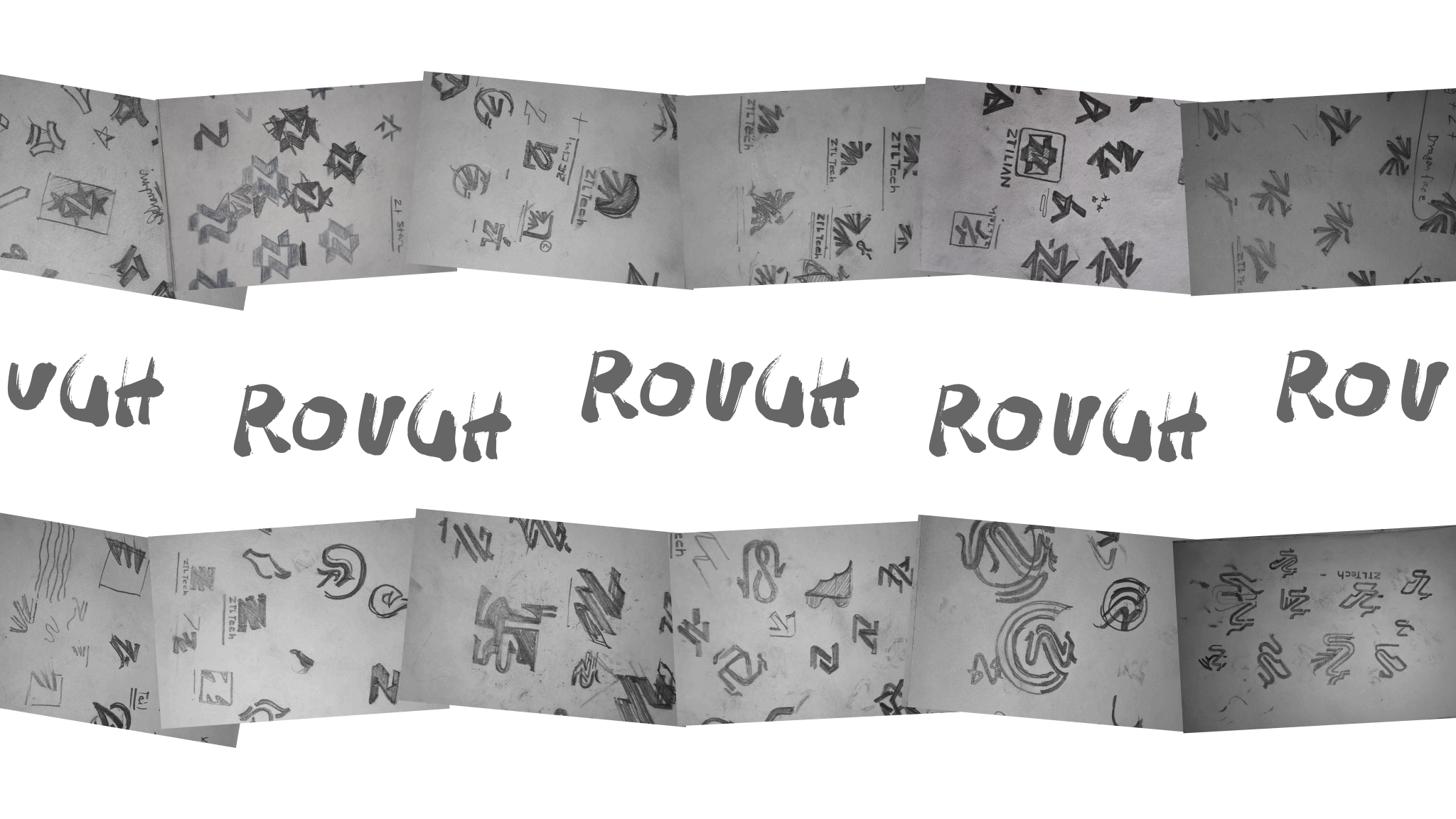
Explore before committing
At this stage, we can investigate several interpretations of the same brief. The pencil keeps the emphasis on the idea: a silhouette, a gesture, a relationship between letters or a useful space inside a form. A small drawing can reveal a direction worth pursuing before it is polished digitally.
Select with a reason
We compare the promising directions with the creative brief. Which has the clearest connection to the business? Which reads at a small size? Which feels distinctive within the category? Selection is a design decision, supported by the research and the needs of the brand.
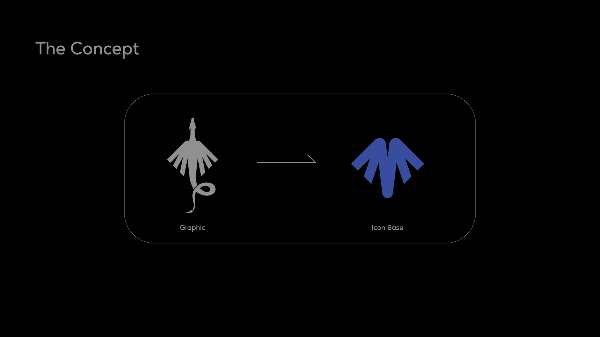
Find the essential feature
Abstraction depends on deciding which visual characteristics carry the idea. We reduce descriptive detail, compare silhouettes and consider how the form reads without its original context. The aim is a mark with a clear visual structure and a relevant relationship to its starting point.
Refine the visual language
The selected form is developed through proportion, curves, spacing and optical correction. We then consider its relationship with the brand name, the palette and the intended applications. The concept continues to guide those decisions as the identity becomes more precise.
04 / The complete design process
Every stage.
Every decision connected.
This is how we connect client insight with a usable identity. The scope can be focused or extensive; we agree the relevant stages, review points and deliverables before the project begins.
Discuss the right scope for your brand ↗-
01
Client input & brand discovery
Listen before drawing
We begin with a conversation about the business and the people it needs to reach. What do you offer? Why do customers choose you? What should a first encounter communicate? We ask about the brand name, its pronunciation, the story behind it, the products or services, and the context in which the identity will appear. A manufacturing supplier, an editorial platform and a consumer brand may need very different visual behavior, even when their founders like the same reference images.
Your input is essential. Existing brand assets, a short company profile, product photographs, a website, examples you admire and examples you dislike can all help. We also ask what those references mean to you: confident, precise, welcoming, premium, playful or something more specific. Preferences become more useful when they are connected to a reason. We identify the decision-maker, stakeholders and practical constraints so the design has a clear point of reference throughout the engagement.
What this stage establishes
A shared understanding of the business, audience, expectations and decision process. -
02
Market & competitor research
Understand the world around the brand
Next, we examine the visual environment the logo must enter. We look at direct competitors, adjacent categories and the places where your audience encounters businesses like yours. Repeated symbols, familiar color combinations, naming patterns and common typography choices reveal category conventions. This helps us understand when familiarity is useful and where a more distinctive direction could make the brand easier to recognize.
Research also looks at the audience and the application. A symbol on a small product label behaves differently from a sign across a building or an avatar on a phone. We discuss geographic and language contexts when they affect reading or interpretation. The objective is a relevant point of difference, supported by observations we can explain. We do not treat a collection of fashionable logos as a strategy, and competitor research does not mean borrowing another business’s mark.
What this stage establishes
An informed view of the category, audience, visual conventions and opportunities for distinction. -
03
Positioning & the creative brief
Give the work a direction
Discovery and research become a focused creative brief. This records what the logo should communicate, which audience it should serve, where it will be used and what would count as a useful outcome. We distinguish essential requirements from preferences. A legal name, a multilingual lockup or a required relationship with an existing parent brand can be a constraint; a favorite color can be a starting point to explore.
We agree the scope before detailed design begins. That includes whether the engagement covers a symbol, wordmark, monogram, emblem, a combined identity or an extended brand system. The brief also establishes the presentation process, review stages, deliverables and any application-specific requirements. A clear brief gives everyone a shared basis for decisions. When feedback arrives later, we can ask whether a direction supports the agreed audience and position rather than relying entirely on individual taste.
What this stage establishes
A concise brief connecting brand meaning, design requirements and the agreed scope. -
04
References, mood & design principles
Explore a visual territory
We explore visual directions that could express the brief. These might contrast geometric precision with a more human stroke, an expressive wordmark with a quieter supporting system, or an illustrated emblem with a simple typographic identity. References can come from lettering, architecture, tools, craft, materials, packaging and the business itself. Their purpose is to establish qualities and relationships, not to provide a finished shape to copy.
We consider what a proposed direction would mean in practice. If the identity should feel technical, how do proportions, spacing and construction communicate that without becoming cold or generic? If it should feel artistic, how can it remain legible and consistent? This stage turns broad adjectives into visual decisions. It also helps the client identify meaningful differences between directions before the team spends time refining individual marks.
What this stage establishes
Visual principles that translate positioning into a coherent design direction. -
05
Hand sketching & idea exploration
Think with the pencil
Sketching is where an abstract brief begins to take visual form. We explore initials, silhouettes, gestures, negative space, word shapes and relationships between elements. Working quickly on paper makes it easier to test several interpretations without committing to a polished digital object too early. A rough drawing can ask a useful question: could this letter also suggest movement, could this space carry the idea, or could the name itself become the strongest part of the identity?
Many sketches are exploratory and are not intended for presentation. We compare directions, combine promising relationships and set aside approaches that are too obvious, too complex or disconnected from the brief. Our sketching montage on this page shows that working texture: repeated studies, alternatives and imperfect marks. It is evidence of thinking through form. The value of the exercise lies in the decisions it makes possible, rather than the number of sheets produced.
What this stage establishes
A broad exploration of possible marks, followed by a considered shortlist. -
06
Concept development & abstraction
Give the form a reason
A strong concept connects a meaningful idea with an economical visual form. We look for an association that belongs to the brand: a process, an initial, a quality, a relationship or a useful metaphor. We then ask how much detail is necessary to preserve that association. Simplifying a graphic requires choices about which features carry the meaning and which features only describe the original object.
Our concept board makes this stage tangible. It shows a detailed gray graphic being translated into a simpler blue icon base. The resulting silhouette has to read as a controlled mark rather than a miniature illustration. During a project, we explain the reasoning behind the selected direction, including the role of negative space, orientation and proportion. A story can support a logo, but the drawing also needs to communicate clearly when the explanation is not beside it.
What this stage establishes
A concept with a clear rationale and a visual form that can work independently. -
07
Vector construction & optical balance
Make the drawing precise
Promising sketches are developed into editable vector artwork. We refine contours, control points, corners, stroke relationships and the spaces between shapes. Curves should feel intentional, edges should meet cleanly and the mark should remain stable when scaled. We use construction guides where they help, while checking the result by eye. Mathematical equality does not always produce an equally balanced appearance.
Optical corrections can involve slightly adjusting a curve, changing the weight of a diagonal or opening an enclosed space. We examine the silhouette in a single color and at small sizes to see whether the central idea survives. Clean vector construction also matters for future production: an organized shape is easier to export, reverse, print or prepare for a specialist application. The objective is technically sound artwork that retains the character of the original idea.
What this stage establishes
Refined master artwork with deliberate geometry, clean contours and optical consistency. -
08
Typography, custom lettering & font design
Make the name part of the identity
Letterforms influence the voice of a brand before a word is read in full. We consider the structure, rhythm, width, weight and character of the lettering alongside the symbol. Depending on the direction, the work can involve selecting a suitable licensed typeface, modifying permitted letterforms or drawing a custom logotype. Kerning and the relationship between individual letters receive close attention because a small spacing error can make an otherwise convincing wordmark feel unresolved.
Custom lettering can create details that belong specifically to the name: a distinctive terminal, a repeated angle, a linked stroke or a carefully shaped counter. We test readability and avoid adding features merely to make the lettering unusual. A custom wordmark is different from a complete usable font family. If a project needs an actual font, we scope the character set, weights, spacing, kerning, language support and font-file delivery separately. Supporting fonts and their permitted uses are documented as part of handover.
What this stage establishes
A considered typographic voice, with the scope of custom lettering or font work made explicit. -
09
Symbols, emblems & illustration
Choose the right amount of expression
Some brands are best served by a restrained symbol; others need an illustrated emblem or a more expressive mark. We explore how much visual information the identity can carry without becoming difficult to reproduce. Gesture, personality and a recognizable silhouette can give an illustration a role inside the identity. The same drawing may need a simplified companion for small digital uses.
We distinguish the core logo from the wider illustration system. An editorial illustration can contain detail that would overwhelm an application icon, while a mascot may need poses or expressions beyond the primary mark. These extensions are scoped intentionally. On this page, our work spans simple wordmarks, geometric symbols and the more detailed IN·GENIUS·VR emblem. Different approaches solve different communication needs; a professional process chooses the level of detail that belongs to the brief.
What this stage establishes
An appropriate relationship between the primary mark, illustration and supporting visual assets. -
10
Color, contrast & reproduction
Build a deliberate color system
We explore color in relation to the concept, category and intended applications. A palette should help establish recognition while giving the brand enough flexibility for real layouts. We review the logo on light and dark backgrounds, in a single color, and alongside supporting text and imagery. A design that depends entirely on a delicate gradient may need a simpler version for situations where that effect cannot be reproduced.
Digital and print reproduction need separate attention. We prepare relevant color references for the agreed outputs, explain where screen and print appearances can differ, and identify when a specialist production proof is needed. The logo palette also informs supporting layouts, where readable text contrast is important. We define practical combinations and avoid assuming that every brand color should be used for small text. Color is part of the identity’s working system, supported by one-color and reversed alternatives.
What this stage establishes
A usable palette with practical background options and appropriate production references. -
11
Concept presentation & real applications
Explain the decisions
We present the selected design directions with their reasoning. The presentation relates the mark to the brief: what idea it communicates, why the lettering has that character, how the symbol is constructed and how the identity can be applied. Clear neutral views show the actual artwork. Application studies then provide context, helping you judge whether it feels appropriate on a website, stationery, packaging or another agreed touchpoint.
Context is useful when it answers a question. A small header can reveal whether the wordmark is too wide; a monochrome application can reveal whether the symbol depends on color; a product label can reveal a spacing problem. We do not rely on an attractive mockup to resolve an unclear design. The client should be able to compare directions using both the rationale and the visible behavior of the mark.
What this stage establishes
A presentation that connects design choices with the brief and demonstrates practical use. -
12
Client feedback & design iteration
Refine with a shared purpose
Your feedback helps connect the proposed identity with the reality of the business. We ask you to consolidate stakeholder comments and explain the reason behind a concern. “The mark feels too formal for our audience” gives a more useful direction than “make it more modern.” We discuss which observations relate to the agreed positioning, which concern practical use and which are individual preferences.
Refinement can involve proportion, line weight, spacing, a letterform, the relationship between symbol and name, or the color balance. We keep track of the selected direction so revisions improve a coherent idea. Combining unrelated favorite fragments from several concepts can weaken that idea; if a new requirement changes the brief, we discuss what that means for scope. Review rounds and approval points are agreed for the engagement, with feedback and decisions recorded clearly.
What this stage establishes
A refined direction developed through focused feedback, with clear approval checkpoints. -
13
Legibility, scale & application testing
Check the mark outside the artboard
Before the identity is finalized, we examine the logo in the conditions it is expected to face. That includes small-size reading, light and dark backgrounds, a one-color version and the relevant print or digital applications. We check whether counters close, fine details disappear, a symbol loses distinction or the wordmark becomes difficult to read. Minimum-size guidance should follow the actual artwork and intended reproduction method.
We also inspect exported files for clipping, unexpected backgrounds, excessive canvas space, rasterization or font substitution. A responsive identity may need a full lockup, a compact version and a standalone mark. Where embroidery, engraving, signage, stamping or specialist printing is required, we discuss supplier constraints and any production-specific adaptation. Testing is about finding and resolving practical weaknesses before the logo becomes part of everyday business material.
What this stage establishes
A reviewed set of versions, with known reproduction constraints and use guidance. -
14
Visual identity & brand applications
Make recognition consistent
A logo becomes more useful when it belongs to a coordinated visual system. We can extend the approved direction into typography, palette, layout principles, supporting graphics, iconography and illustration. These choices help a website, a quotation document and a social post feel connected without making every layout identical. The exact applications depend on the engagement and the ways the business communicates.
Possible deliverables include business cards, letterhead, email signatures, social assets, packaging directions, presentation templates, ebooks or a website design system. Our Jia Heng presentation shows an identity across several applications, making the relationship between mark and context visible. Extended identity work is planned explicitly so the business knows which assets are ready to use and which examples are presentation studies rather than production files.
What this stage establishes
An agreed identity system and selected applications that support consistent use. -
15
Master files, exports & guidelines
Deliver files people can use
Handover should make the identity usable by the client, developers, printers and future collaborators. We prepare the agreed editable master artwork and appropriate exports for the intended applications. The package can include vector formats, transparent raster images, light and dark variations, a single-color mark and social or favicon assets. Each file should have a clear purpose and a sensible name.
Usage guidance explains clear space, proportions, background choices, minimum sizes, typography and common mistakes to avoid. We identify any third-party font or asset requirements and explain which source materials are included under the agreed scope. A short walkthrough can help your team select the right files rather than repeatedly asking for another export. Production handover is complete when the next person understands how to apply the identity consistently.
What this stage establishes
An organized delivery package with usable exports, master artwork and agreed guidelines. -
16
Launch, transition & future support
Help the identity settle into use
A new identity needs a practical rollout. We can help prioritize the website, social profiles, documents, product interfaces and other touchpoints so the change feels intentional. For an existing business, some familiar characteristics may need to be retained, and older material may require a transition period. We discuss which applications are changing immediately and which will follow as existing stock or systems are updated.
After delivery, further work may include a new lockup, a translated version, an additional template or a production adjustment requested by a supplier. We agree how that support is handled. Nuo Pixel Solutions also designs and develops websites, applications and other digital systems, so an identity can continue into a functioning product with the same design reasoning behind it. The logo is a foundation for consistent communication as the business develops.
What this stage establishes
A clear rollout approach and a route for the identity’s next applications.
05 / The craft in the detail
Letters have a voice.
Small adjustments matter.
Try a simple typography study and a size preview. They make two design decisions tangible: how spacing changes the tone of a name, and how a real mark behaves as it gets smaller.
Interactive / Typographic rhythm
These browser fonts demonstrate rhythm and tone. Custom logo lettering is drawn and refined around the brief; a complete font family is a separately defined scope.
Interactive / Read it at scale
From a bold mark
to a small signature.

This on-screen preview uses our Wayzao wordmark. Final minimum-size guidance is established for each identity and its intended reproduction methods.
Try small sizes, then open the original vector artwork in the gallery to inspect the contours at a larger scale.
Kerning & rhythm
Letter spacing is a relationship between specific shapes. Round, diagonal and vertical forms create different apparent spaces. We adjust the word as a whole and inspect individual pairs, seeking an even visual rhythm while preserving the character of the lettering.
Geometry & optics
Guides help organize a mark, but optical judgment resolves it. A curve may need to extend slightly farther, a diagonal may need a different weight and a small enclosed shape may need more room. We evaluate the visual result at the sizes people will actually see.
Illustration & simplicity
An illustrative mark can express rich character when the context supports it. We consider silhouette, contrast and detail density, then plan simpler companions where needed. The identity can carry expressive artwork and still provide a compact, practical mark for smaller applications.
06 / Beyond the logo
A mark becomes
an identity through use.
The logo establishes a visual anchor. A coherent system carries its character into the things the business makes and shares.
The Jia Heng presentation brings several applications together: stationery, printed pieces, signage and visual studies that place the identity in context. Open the presentation to inspect the individual details at full resolution.
We can develop the supporting typography, palette, graphic language and layout principles that connect those applications. The purpose is consistency with room for different kinds of content. A proposal, a social graphic and a website should feel related while remaining useful in their own formats.
From presentation to production
We agree which applications are part of the deliverable set and prepare the relevant assets for their intended use. Layout specifications, export requirements and supplier constraints can all influence the final artwork. A presentation helps establish direction; production files need the additional detail required by the person implementing them.
Carry your identity into the interface ↗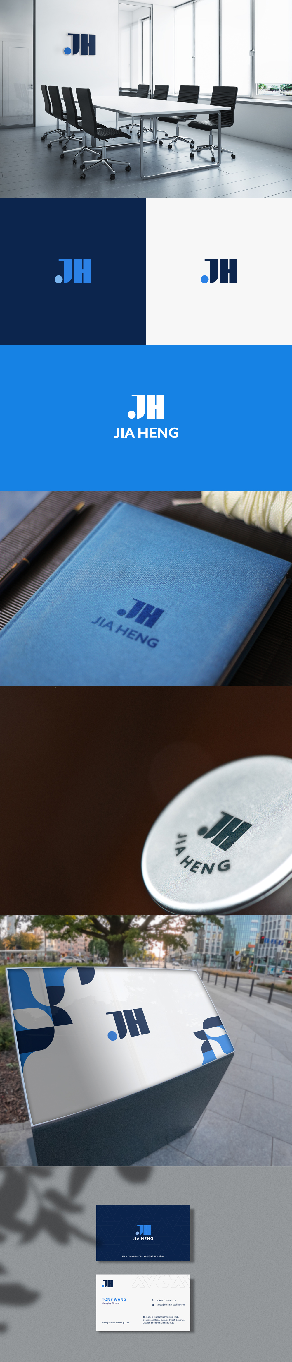
07 / Production-ready handover
The right files.
The guidance to use them.
We define the delivery package around your actual applications. The table explains the purpose of common outputs; your proposal identifies the formats, variations and supporting assets included.
| Component | What it is for | What we clarify |
|---|---|---|
| Vector master artwork | An editable foundation for the approved identity and future export needs. | Source format, included elements and how the files are organized. |
| SVG | Sharp digital artwork for websites and compatible applications. | ViewBox, proportions, paths, background behavior and any embedded dependencies. |
| PDF / print-ready vector output | Sharing the mark with printers and production partners. | Supplier requirements, color references and any production-specific preparation. |
| Transparent PNG | Presentations, documents and applications that need a raster image. | The intended size, background variation and export resolution. |
| Primary and alternate lockups | Horizontal, stacked or compact arrangements where the identity requires them. | Which arrangement belongs in each application and how the proportions are protected. |
| Single-color and reversed versions | Applications with restricted color or dark backgrounds. | The appropriate artwork for each background and reproduction condition. |
| Typography and color guidance | A repeatable foundation for related layouts. | Chosen fonts, licensing responsibilities, color values and useful combinations. |
| Usage guidelines | Helping the client and collaborators apply the identity consistently. | Clear space, minimum sizes, approved variations and examples of correct use. |
| Optional application assets | Social graphics, favicons, business cards, templates or other agreed touchpoints. | The actual deliverables, dimensions, editing needs and production handoff. |
Your feedback is part of the craft.
We work with the client through considered review stages. Explain the reason behind a reaction, connect it to the audience and collect stakeholder comments into a shared response. We can then refine a direction with a clear purpose, protect the central concept and resolve practical concerns before the work is approved.
For example, a concern about reading the name in a mobile header can lead to a useful spacing or lockup adjustment. A new request to target a different audience may require returning to the brief. Clear communication helps us distinguish those decisions and agree the right next step.
Bring us the beginning.
A company name, a description of what you do and a few observations about the intended audience are enough to start. If you already have a logo, tell us what should remain recognizable and what is causing difficulty. We can discuss whether the right engagement is a new identity, a refinement or an extension of existing work.
Start with a short message ↗08 / Questions, answered
Before the first sketch.
How the process works, why an identity matters and what to expect when working with Nuo Pixel Solutions.
How can a logo change a brand’s identity?
A logo gives people a repeatable visual cue for the business. A well-considered redesign can make the intended character clearer, bring disconnected materials together and help the brand appear more consistent across touchpoints. It can also support a change in positioning, audience or product range. Recognition grows through repeated, coherent use alongside the actual customer experience. A logo cannot replace a clear offer or good service, so we design it as part of the wider identity rather than treating the symbol alone as the whole brand.
What happens during a logo design project?
We begin with client input and discovery, research the audience and competitive environment, and agree a creative brief. We then explore visual directions, sketch ideas, develop concepts and refine selected artwork in vector form. Typography, custom lettering, color and applications are considered together. You review the proposed directions, give consolidated feedback and approve a refined result. The final stages cover practical testing, file preparation, usage guidance and the agreed handover. The scope and review stages are defined for your project.
What information do you need from us before starting?
We need to understand the business, the exact brand name, what you offer, who the audience is and why the project is happening now. Existing logos, a website, product information and reference images are useful when available. Tell us where the logo will be used, who will approve it and whether any languages, partner relationships or production methods introduce constraints. You do not need to write a long specification before contacting us; a short introduction is enough to begin the discovery conversation.
Do you research our market and competitors?
Yes. We look at the surrounding category to understand common visual signals and opportunities for distinction. That includes competitor marks, naming patterns, color habits and the environments in which your customers encounter the brand. We connect those observations with your audience and positioning. The research guides an original direction for your business. It is a design research activity; any specialist naming, registration or legal clearance work is discussed separately if it is required.
Why do you start with hand sketching?
Sketching lets us ask visual questions quickly. A small pencil drawing can test a silhouette, a letter relationship or a negative-space idea without the commitment of polished digital artwork. It also makes it easier to compare approaches and develop a more personal line of thought. We move promising ideas into vector construction once their purpose is clear. The sketching montage on this page shows exploratory studies from our work, including alternatives that are part of developing a direction.
What do you mean by deriving a logo from a concept?
We mean connecting a relevant idea with a clear visual form. A concept might originate in a process, an initial, a product characteristic, a gesture or an association that belongs to the brand. We identify the essential features and simplify them into a mark that can stand on its own. The concept board shown here demonstrates the translation of a detailed graphic into a simplified icon base. We explain the reasoning, while checking that the result reads clearly without a long explanation.
Will you design an original logo for our business?
Our process develops directions around the brief, with research, drawing and refinement tailored to the business. We do not treat a ready-made stock mark as a substitute for that work. During scoping, we discuss any existing elements that must be retained and any third-party assets or typefaces that may be involved. The final agreement defines the deliverables and rights for the engagement. If you need a specialist clearance process, tell us early so it can be planned alongside design.
Can you create custom lettering or design a font?
Yes. We can draw or refine lettering for a distinctive logotype and develop letterforms around the character of the name. That includes spacing, proportions, terminals and the relationships between letters. A complete installable font is a separate scope because it requires a defined character set, spacing behavior, kerning and possibly multiple weights or language support. We clarify whether the project needs custom logo lettering, selected supporting fonts or an actual typeface family before committing to the deliverables.
Do you design illustrative logos and emblems as well as simple marks?
Yes. Our capabilities include graphic design and illustration alongside typographic and geometric logo design. We can explore an illustrated emblem, a character or a more expressive symbol when it fits the brief. We also consider how that detail behaves at small sizes and whether a simplified version is needed for applications such as favicons or compact navigation. The level of detail follows the audience, positioning and intended use rather than a rule that every logo must have the same style.
Can you improve an existing logo instead of replacing it?
Yes. A refinement can preserve recognizable characteristics while improving lettering, spacing, proportions, reproduction or file quality. We first discuss what existing customers recognize and what is causing difficulty. Some projects need a careful cleanup; others need a broader rethink because the business has changed. We explain the options before moving into detailed design and can compare proposed improvements with the current identity at relevant sizes and applications.
How many concepts and revision rounds are included?
The number of presented directions, review rounds and final variations is agreed in the project scope. We distinguish internal exploration from the concepts selected for a client presentation. More sketches do not automatically produce a better outcome; useful directions need time for reasoning and refinement. Clear review checkpoints and consolidated client feedback make the work easier to evaluate. If the brief changes or further exploration is requested, we discuss the additional work before proceeding.
How should we give feedback on a concept?
Relate your feedback to the brief and describe the reason behind the reaction. For example, you might explain that the lettering is difficult to read at a small size, that the symbol feels too playful for the intended audience or that a required application has been missed. Consolidate comments from the decision-makers into one response where possible. We can then separate practical issues from preferences and develop a coherent direction without receiving conflicting instructions from several people.
Will the logo work on our website, social profiles and printed materials?
We plan versions around the applications agreed for the project. A full horizontal lockup may work well in a website header, while an avatar or favicon may need a compact mark. Print work may require a vector file and a single-color version. We check backgrounds, proportions and small-size reading, and prepare the appropriate exports. Specialist processes such as embroidery, engraving or signage may require supplier-specific adjustments and production proofs, which should be identified during scoping.
Which files will we receive?
The delivery package is agreed before work begins. It can include editable vector master artwork, SVG or PDF exports, transparent PNGs, single-color and reversed versions, and any specified social or favicon assets. A guideline document can record spacing, minimum sizes, typography and color references. We label files by purpose so a developer, printer or colleague can select the right one. Font files and other third-party source assets are supplied only where their licensing and the agreed scope permit.
Can you create the complete visual identity and website?
Yes. Nuo Pixel Solutions works across logo design, visual identity, graphic design, illustration, UI/UX, websites and web applications. We can carry the identity into components, page layouts, documents and other agreed touchpoints, then implement a website or product where required. That work is scoped as a connected engagement or a later phase. The logo design package itself does not automatically include every application shown in a presentation.
How long does a logo design project take?
Timing depends on the research, the type of mark, the number of stakeholders, the required applications and the speed of feedback. A focused refinement and a new multilingual identity system involve different amounts of work. After discovery, we propose a realistic sequence of research, presentation, refinement and handover milestones. If you have an event, launch or production deadline, tell us at the beginning so we can assess what can be completed and approved responsibly.
What does logo design cost?
We estimate the work after understanding the brief, deliverables and review process. The scope may range from a focused logo engagement to custom lettering, an illustrated identity or a larger brand system. Research, production requirements and any additional applications affect the estimate. Send us a short description of the business and what you need; we can clarify the scope and provide a proposal without asking you to complete a lengthy form first.
Are the logos and process images on this page your work?
The gallery and process images show Nuo Pixel Solutions’ logo and identity design work. They include wordmarks, symbols, an illustrated emblem, a sketching montage, a concept board and a longer identity presentation. Each image can be opened for a clearer view. The collection gives you a closer look at our visual range, from restrained typography to detailed illustration and identity applications.
Can we protect or register the final logo?
Tell us during discovery if registration, naming clearance or specialist legal review is part of your plans. We can organize design files and coordinate the design process around requirements supplied by your adviser. The design scope and agreement explain what we deliver. Formal searches, registration decisions and legal advice belong with a qualified specialist and are not implied by a logo presentation or a competitor design review.
How do we start a logo project with Nuo Pixel Solutions?
Use the short inquiry form below or email contact@nuopixel.com. Tell us the business name, what you do and whether you need a new identity or an improvement to an existing logo. If you have a website, a deadline or a few useful references, you can mention them in the message. We will follow up to understand the audience, applications and scope. Please leave passwords and confidential source files out of the initial inquiry.
09 / Start a conversation
Tell us the story
behind your name.
A new brand, a fresh direction or a logo that needs careful refinement—we’d like to hear what you have in mind.
Send a short introduction. We’ll follow up to understand your business, audience, applications and the scope of the work. You can share useful references as the conversation develops.
contact@nuopixel.com ↗Nuo Pixel Solutions / Design and development since 2015.