Brand identity / Concept · craft · application
WellFit: An F in motion. A fitness identity with a human center.
Nuo Pixel Solutions’ WellFit running concept combines the F initial with an active human figure, then develops the mark through geometry, lettering, color and fitness-brand application studies.
Nuo Pixel Solutions · Design by Nitin Singh · Design and technology since 2015
01 / WellFit
A brief that connects equipment and well-being
The WellFit concept presentation describes a brand associated with treadmills and a broader vision of health, vitality and lifestyle. That combination creates a useful design challenge. A literal machine drawing could identify a product category, but it might limit the identity’s meaning. An overly abstract wellness symbol could feel disconnected from movement. Our presented direction brings a person in motion into the brand’s own initial.
Nuo Pixel Solutions developed an F/running-figure concept. The F relates to the “Fit” portion of the name, while the dynamic silhouette gives the mark a human focus. The result is intended to connect fitness equipment with the activity it supports, rather than making the machine itself the entire identity.
This case documents the running concept and its supplied presentation, including a construction study, wordmark, color page, application mockups and behind-the-scenes sketches. It does not assert that each application was manufactured or that the identity produced a measured improvement in brand recognition. Those outcomes require evidence beyond a concept deck.
02 / WellFit
Combining an initial and a moving person
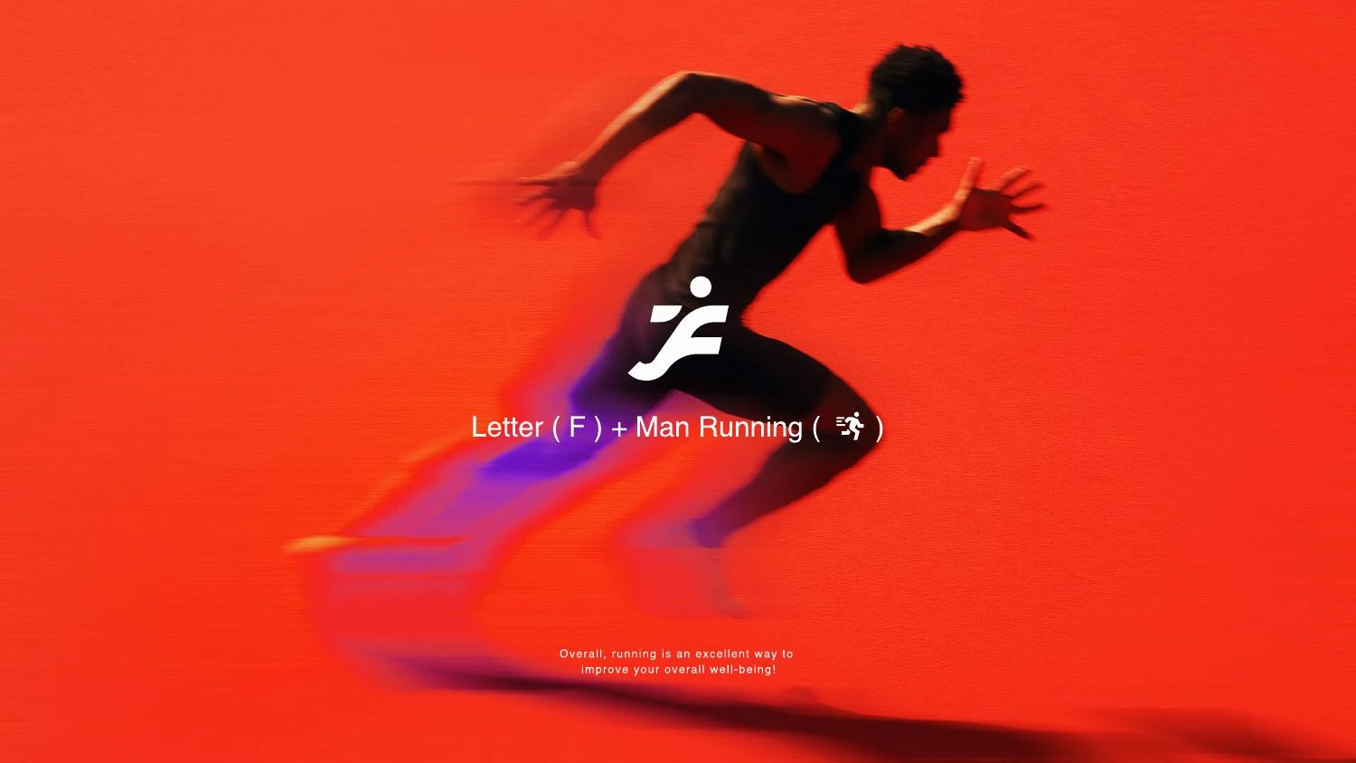
The concept page explicitly presents the equation: the letter F plus a running person. This is a synthesis, not a small illustration placed next to a letter. The figure’s extended forms and direction of movement are integrated into the symbol so that the two readings occupy the same visual territory.
That approach creates a practical economy. The mark can connect to the name without spelling it out, while its posture gives it a fitness-related meaning. The small detached circular head is a particularly important cue. Without it, the remaining shape might be read as a purely abstract letter. With it, the gesture becomes more obviously human.
The drawing must still work as a compact sign. Too much anatomical detail would weaken the initial and make reduction difficult. Too little could remove the sense of movement. The design problem is therefore one of selecting the minimum useful cues: direction, posture, separation and a recognizable relationship between the head and body.
03 / WellFit
Turning energy into controlled geometry
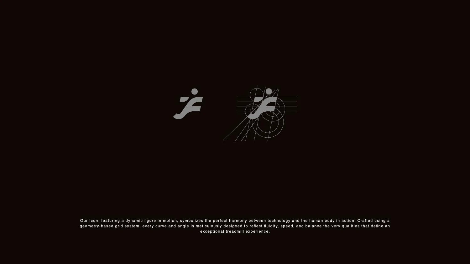
The construction study describes a geometry-based grid and shows the icon against measured relationships. A grid is helpful for establishing consistency, but a moving figure cannot be judged solely by equal dimensions. A limb can appear heavier because of its angle. A narrow gap can disappear when the symbol is reduced. The contour needs optical review as well as geometric discipline.
Motion in a static mark comes from the relationship of its parts. Forward reach, diagonal direction and an unequal distribution of mass can suggest activity without any actual animation. The mark should remain balanced enough to sit beside a wordmark, while avoiding a rigid posture that contradicts the concept. The most effective refinement often involves very small contour changes.
A production master should also be clean. Resolved shapes, deliberate curves and sensible point placement make the icon easier to export and reproduce. Those decisions matter when a mark moves from a large presentation to a printed equipment label or a small interface asset. The concept’s energy should come from its shape, not from an effect that disappears in another file format.
04 / WellFit
The wordmark carries the same direction
The supplied wordmark has an active, forward-moving character. Its slanted forms complement the runner, helping the name and symbol feel like parts of the same identity. A static, unrelated typographic treatment could undermine the relationship, even if each element looked attractive in isolation.
The technical concern is to preserve readability while expressing motion. Strong slant, close spacing and stylized letters can work in a large brand image but become less clear when reduced. The WellFit name therefore needs review at the sizes where it will actually be used. The relationship between WELL and FIT should remain easy to recognize, rather than relying on familiarity with the brand.
This presentation supports discussion of logo lettering. It does not establish the creation of a complete typeface family. If a client needs a custom font for headlines or an interface, that is a separate scope with its own character coverage, licensing, spacing and engineering requirements. Keeping the distinction explicit helps turn an expressive wordmark into a practical handover.
05 / WellFit
Color decisions and a specification inconsistency
The main presentation uses a vivid orange-red alongside black, white and gray. That relationship gives the identity an energetic accent while retaining strong neutral options. Dark backgrounds allow the light wordmark to stand apart; white grounds give the accent a different visual role. Both should be assessed as approved combinations, not treated as interchangeable recoloring.
The source palette page contains a numerical inconsistency: it pairs HEX #FF4725 with an RGB line that does not represent the same color. The page also shows gray #878787, white #FFFFFF and black #000000. We present #FF4725 as the displayed HEX reference, and would reconcile the conflicting RGB specification against the approved master before preparing production artwork.
This is a useful example of why a beautiful deck still needs a technical preflight. A supplier should not have to guess which number is authoritative. Screen, print and material specifications need a clear source of truth, with proofs where output conditions warrant them. Identifying a source inconsistency is more professional than silently repeating incompatible values as if they were equivalent.
06 / WellFit
Fitness applications with different constraints
The deck places the identity in running imagery, apparel, stationery, a treadmill-related layout, a mobile icon and outdoor material. These application studies explain how the same mark can move between a human activity context and more functional product communication. The runner symbol remains the common element even as the surrounding composition changes.
Apparel raises questions of print size, fabric color and reproduction method. A treadmill label introduces product information, available surface area and viewing angle. A small digital icon removes most of the room for a wordmark. Each application should be prepared intentionally rather than by shrinking the same full lockup into every space.
The pictured applications are presentation mockups. They do not establish a released mobile app, a delivered apparel collection or installed advertising. Before production, actual materials and supplier capabilities should determine the final files. A strong identity system makes those decisions easier by providing appropriate versions, clear-space guidance and a reliable master.
07 / WellFit
Behind the scenes: exploring movement on paper
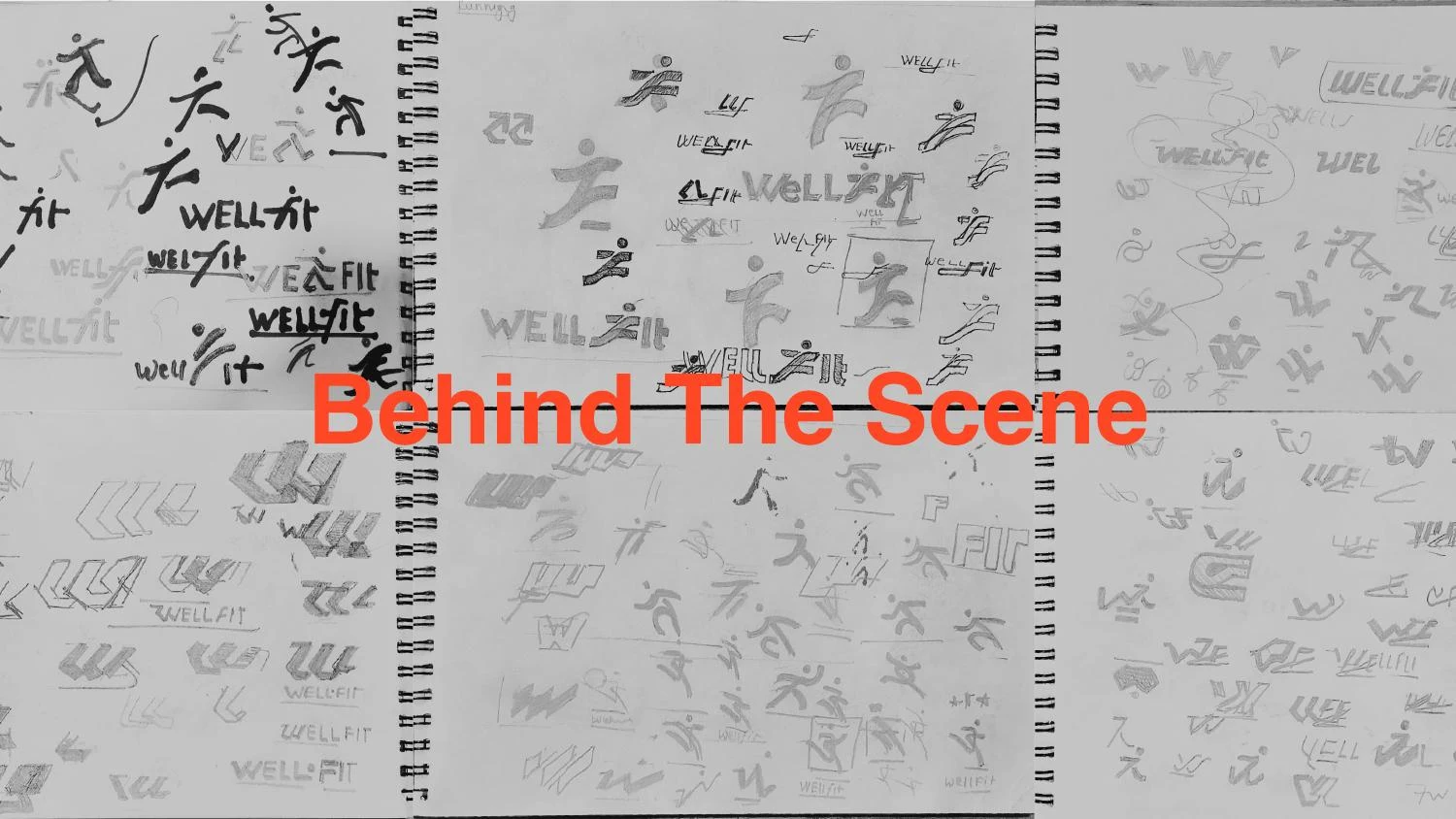
The final source page includes a collection of sketches and alternative studies. It reveals the breadth of possible relationships between initials, human posture and wordmark. That exploration is valuable because a runner symbol can quickly become generic. The task is to find a relationship specific enough to the name and simple enough to survive repeated use.
Sketching tests the idea cheaply. A silhouette can be rejected because it looks unbalanced, because its gesture reads as a different activity or because it fails to connect with the intended letter. At that stage, removing a weak direction is progress. Polishing every sketch prematurely would consume time without resolving the underlying concept.
The source records selected rough work, not a complete project diary. We do not infer exact dates, rounds or client quotations from the montage. The supported story is the progression from a fitness-related objective through an F/runner idea to geometric refinement and application presentation. That is already a substantive design case without invented process detail.
08 / WellFit
Testing an active symbol for everyday use
A reduction review should begin with the head, the narrowest separation and the projecting parts of the figure. Those details carry much of the human reading. If the head disappears or the limbs merge, the mark may lose its intended expression before the overall shape becomes obviously too small. A minimum-use size should follow that observation and the actual output method.
A monochrome test checks the silhouette independently from the energetic palette. It is particularly relevant to equipment marking, limited-color documents and material processes. A reversed version should be evaluated separately, since light forms on a dark ground can appear heavier than dark forms on white. The same file may need different surrounding space even when the shape is unchanged.
In digital use, the identity should be considered alongside the interface rather than substituted for it. A logo can carry expression; navigation, controls and product information need their own accessible contrast and readable typography. These are recommended application checks for the presented identity, not a claim that we audited a specific WellFit production platform.
09 / WellFit
Client review: movement, readability and a reliable handover
A productive review of the WellFit direction should consider the runner and the lettering together. The symbol can be expressive while the name remains clear, but neither should depend on a large promotional image to do its job. The source deck’s dark-background wordmark and smaller application studies provide different ways to examine that balance.
Fitness brands often need to appear in motion-rich imagery. A logo must remain identifiable against a runner, equipment details or a busy training scene. That does not mean every photograph should receive the same white logo in the same corner. The actual contrast, available space and surrounding content should determine whether a light, dark or isolated version is appropriate.
The handover should make those choices explicit. A clean master icon, full wordmark lockup, approved reversed versions and any compact exports should be clearly named. Production artwork should resolve the palette inconsistency before it reaches a supplier. The final package should not force a printer, developer or garment producer to choose between conflicting color values in the original concept deck.
A related distinction concerns the icon’s role. The runner can identify the brand, but it should not automatically become a generic action symbol in an interface. A start-workout control or a navigation item needs its own usable label and interaction design. Keeping brand expression separate from interface meaning prevents a visually appealing identity from creating ambiguity in a working product.
For a future fitness identity commission, our discovery would establish the product range, target audience, key physical surfaces and expected digital uses. We would also clarify whether custom lettering is limited to the logo or extends to a wider typographic system. Those decisions help determine the right deliverables and review criteria. The goal is an identity that feels active while remaining consistent enough for other teams to reproduce with confidence.
10 / WellFit
The value of the combined concept
WellFit demonstrates how a familiar activity can be made more specific through a name-based constraint. The figure conveys movement, while the F gives the symbol a relationship to the brand. The wordmark, construction study and application work extend that central idea instead of introducing unrelated visual effects.
For a fitness or product business commissioning an identity, the practical questions include what should remain constant as the offering expands. Does the brand need to move beyond one machine? Will the logo appear on equipment, apparel, documents and a website? Which small or low-detail applications are most demanding? Addressing those questions early helps avoid a mark that works only in one polished mockup.
Nuo Pixel Solutions combines artistic exploration with technical refinement. This case shows both: a human concept, a controlled vector structure and a concern for the details that make a design usable. The supplied presentation is available below so visitors can inspect the original visual argument alongside our explanation of its design and production implications.
Explore the original design presentation
The selected artwork above is optimized for reading on this page. The original supplied presentation is also available from our WordPress Media Library. It provides the wider visual context, including concept explanations, identity variations and application studies. Where the source shows alternate concepts, those remain explorations rather than an instruction to mix different logo versions.
Application mockups communicate a design direction. Before commissioning physical output, confirm the approved master files, final specifications and requirements of the chosen production process. The analysis here distinguishes the presented work from recommended checks and does not invent commercial results or client quotations.
Practical questions
WellFit case study FAQs
What is the WellFit logo concept?
The supplied presentation combines the F initial with a running person, connecting the name with movement and fitness.
Which orange value should a supplier use?
The deck shows HEX #FF4725 but contains a conflicting RGB line. Production specifications should be reconciled against the approved master before use.
Are the app and apparel mockups live products?
This case presents them as identity application studies. Release or manufacture is not asserted.
Nuo Pixel Solutions / Since 2015
Give your brand a clear, distinctive identity.
Tell us about your business, audience and the places your identity needs to work. We can help with research, concept development, sketching, illustration, logo lettering, vector refinement and a coordinated visual identity.